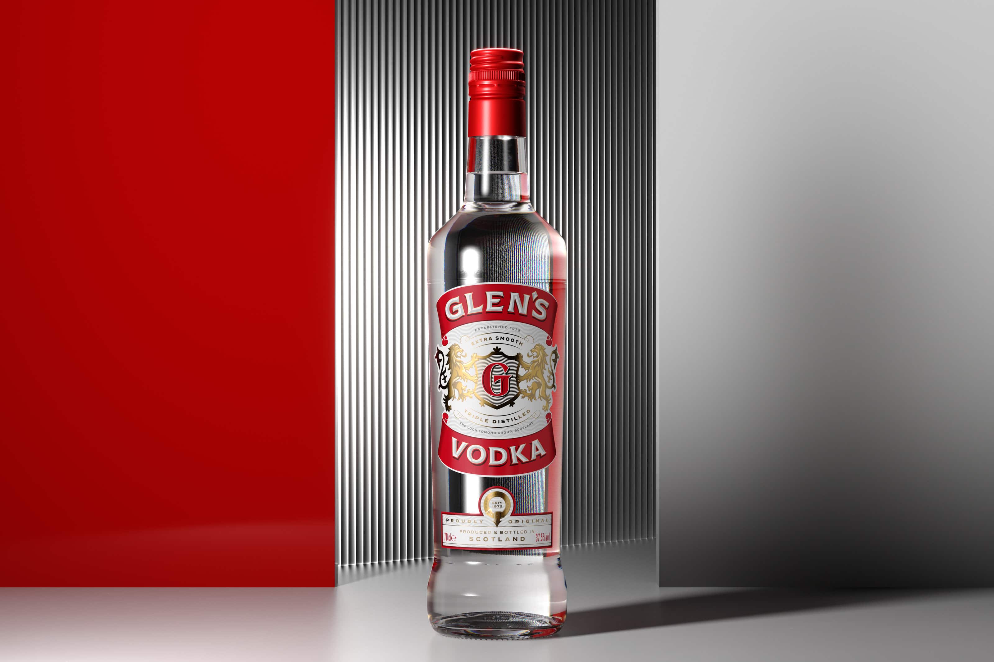
Glen’s Vodka
Services
- VBI
- Packaging
Scottish Spirit Reimagined
Reimagining the brand to recruit new audiences and shift quality perceptions. We repositioned Glen’s as a proudly Scottish brand, deeply rooted in the character of the place and its people. This newly established emotional link with drinkers sets the tone for revived brand behaviour.
Born to take on a category by unapologetically subverting its codes, Glens vodka had become a widely known symbol of Scottish wit and good night’s fun. Yet with ongoing fragmentation and a drifting sense of identity affecting quality perception and impeding growth, the brand needed to reinvent itself to stay relevant with younger drinkers and competitive in convenience channels.
By repositioning Glen’s as a Sip of Real Scottish Spirit, we moved it away from inauthentic provenance to instead taking pride in its own Scottish roots in order to connect with the smart value seeking consumers. This not only elevated its distinct quality story and enhanced cohesion and clarity across the brand’s entire portfolio, but it also set the tone for a more grown up, yet still recognisably witty brand demeanour.
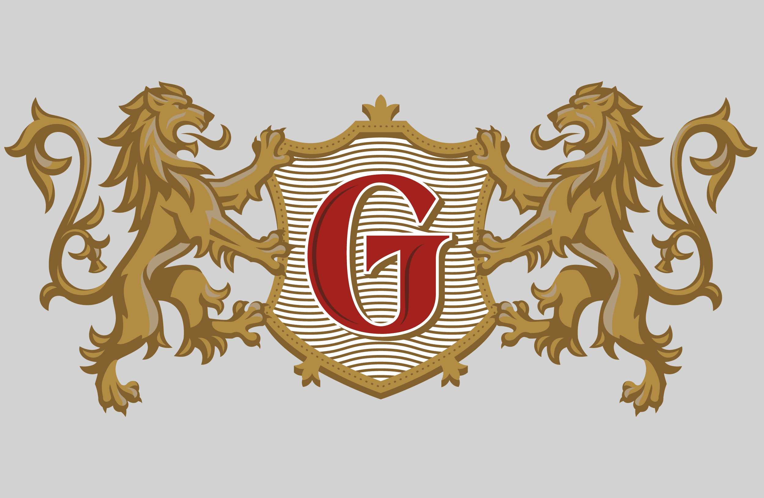
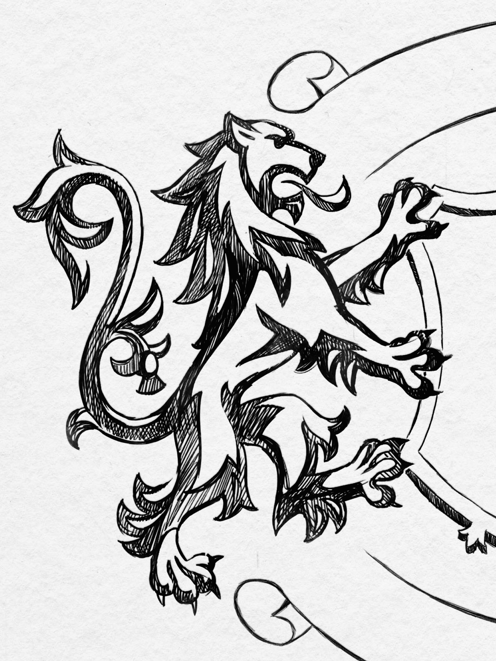
Visually we sought to introduce tactile craft and character in every element, from evolving the brandmark to redrawing the rampant lions, amplifying the brand’s unparalleled, and reliable, taste experience. With a fresh new story to tell and visual equities to convey it, Glen’s Vodka stakes its claim to everyday quality, paving the way for braver growth ambitions.


Related Projects
Explore more projects
View allBruichladdich Distillery Co.
Building a beacon of real progress
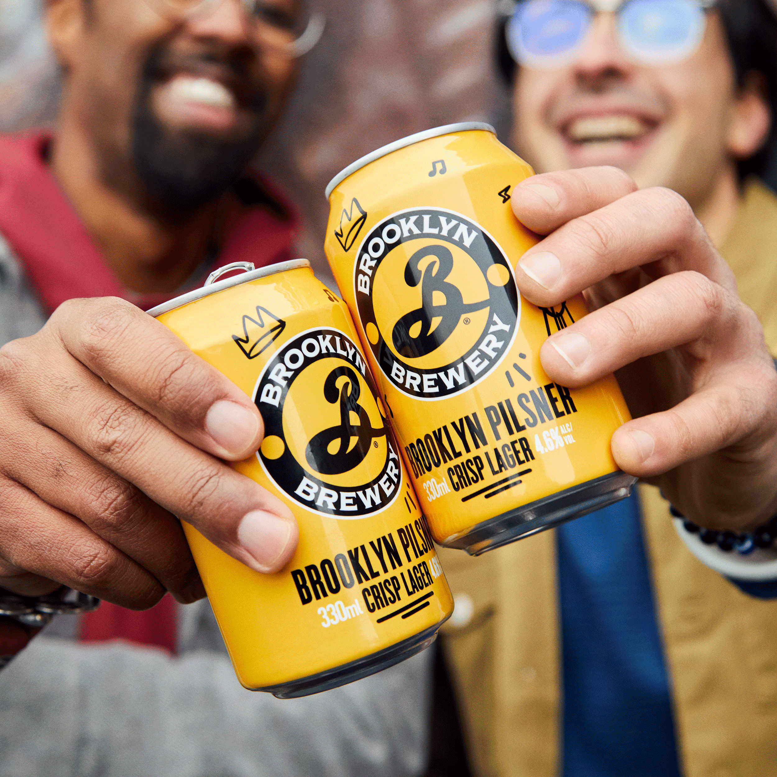
Brooklyn Brewery Pilsner
The New Beacon of Joy
Tennent’s Lager
Refreshing a true Scottish icon
Bruichladdich Distillery Co.
Redefining Luxury. Redefining Age.
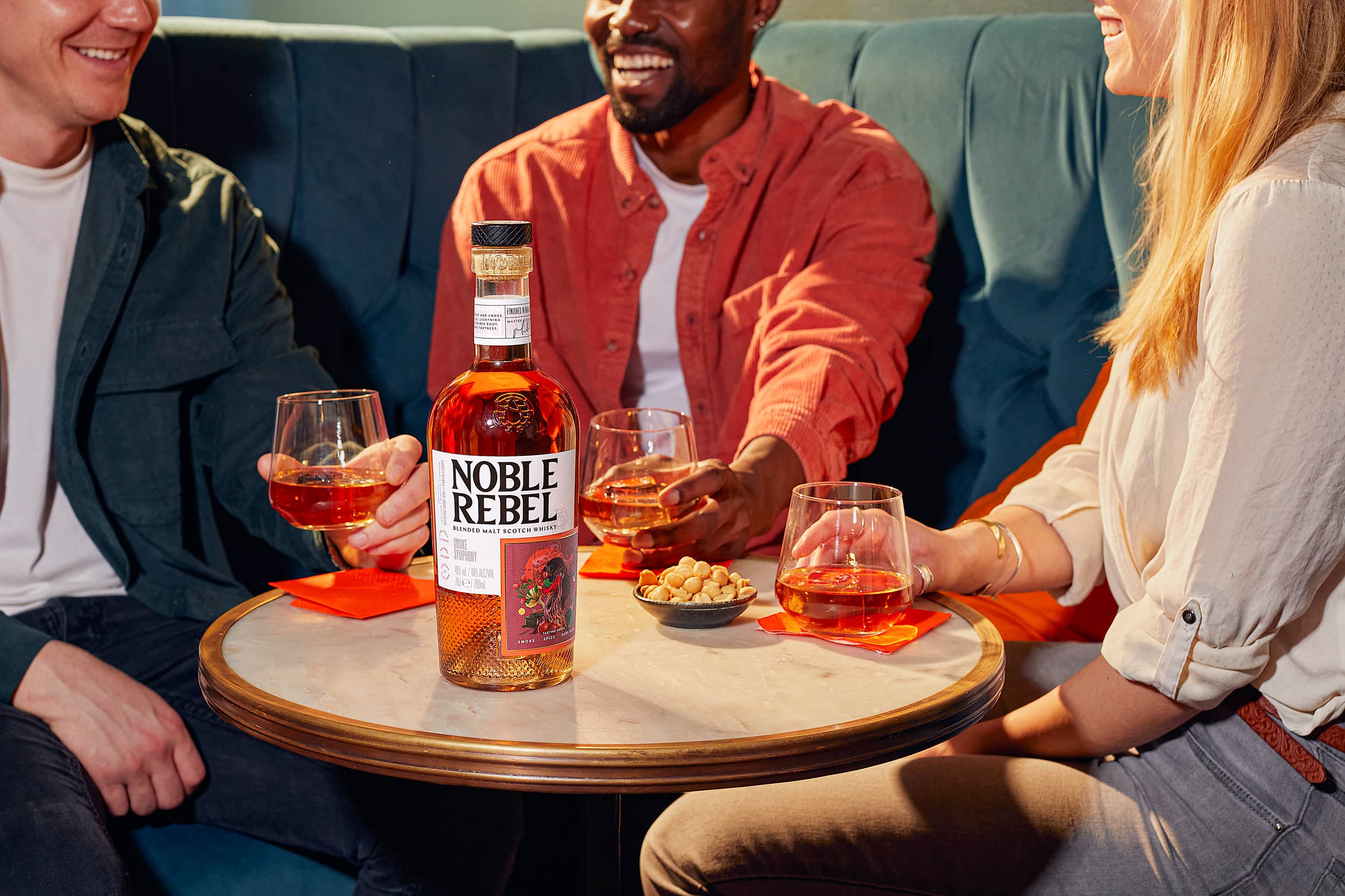
Noble Rebel
Pursuit of Whisky Possibility
Brooklyn Summer Ale
Switch Summer On
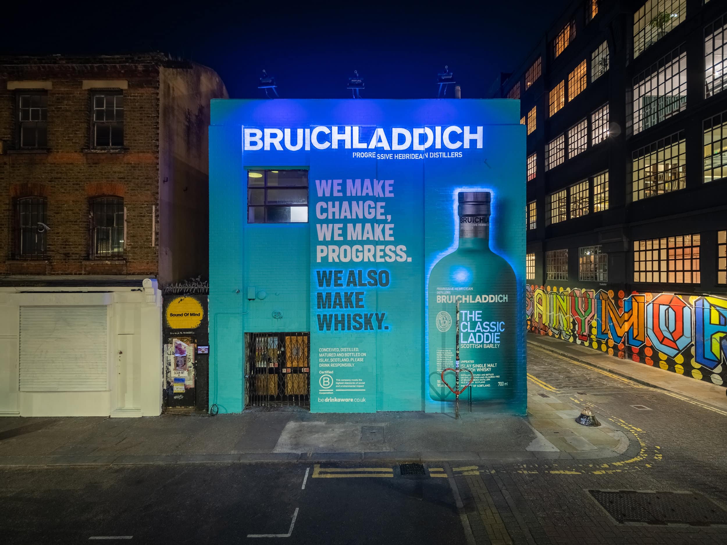
Bruichladdich Distillery Co.
We Also Make Whisky
The Famous Grouse
A BTL world Full of Character
The Botanist Campaign
An invitation to look further