Tennent’s
Services
- Innovation
- VBI
- Packaging
Refreshing a true Scottish icon
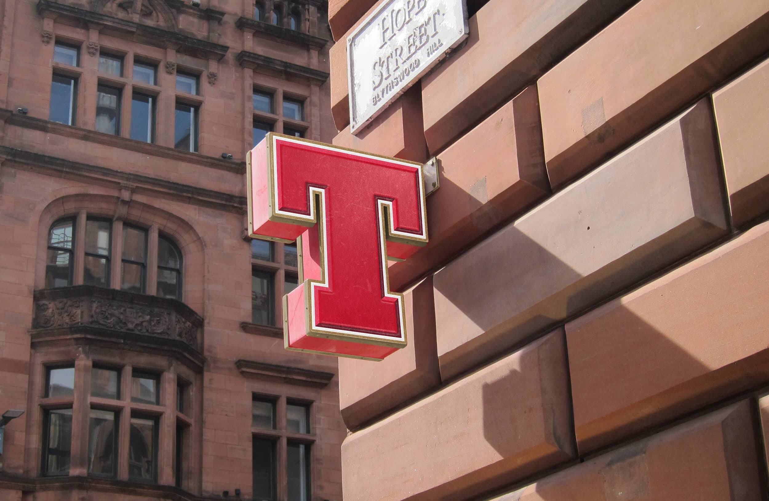
Tennent’s isn’t just Scotland’s best-selling lager. It’s part of the country’s identity. For generations, it’s been poured at gigs, celebrations, football matches and late-night catchups. A brand woven into everyday Scottish culture. Our challenge was to evolve that icon for a new generation without losing the recognisable DNA that made people love it in the first place.
The result was immediate. Following the redesign, Tennent’s delivered a 5% increase in on-trade market share, helping re-establish the brand’s presence in pubs, bars and social spaces across Scotland. More importantly, the conversation around the brand began to shift. Consumers were reconnecting with Tennent’s again — rediscovering pride in a brand that had always been part of Scottish life.
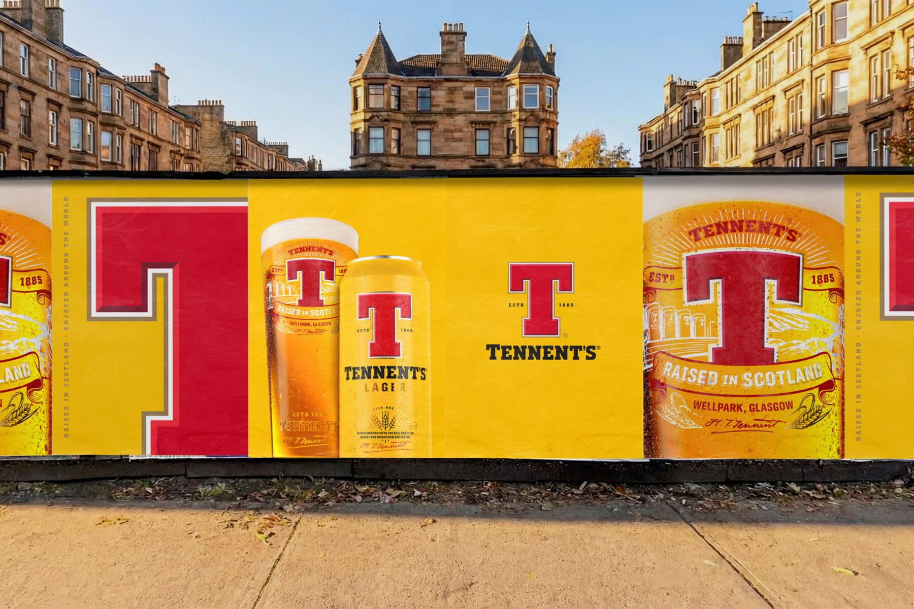
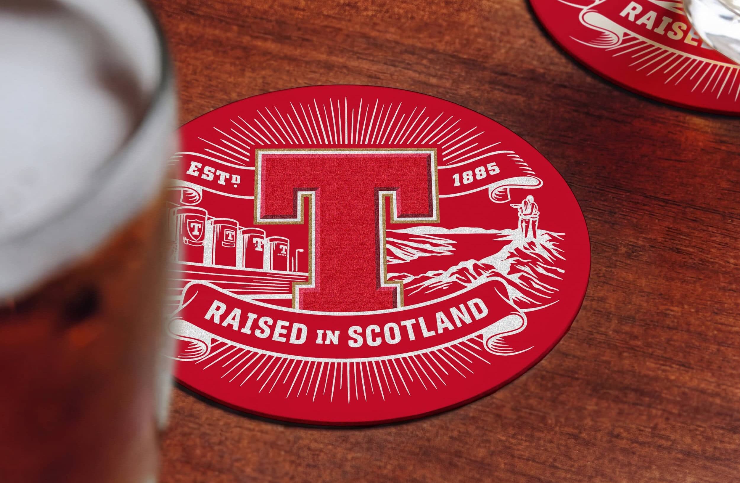
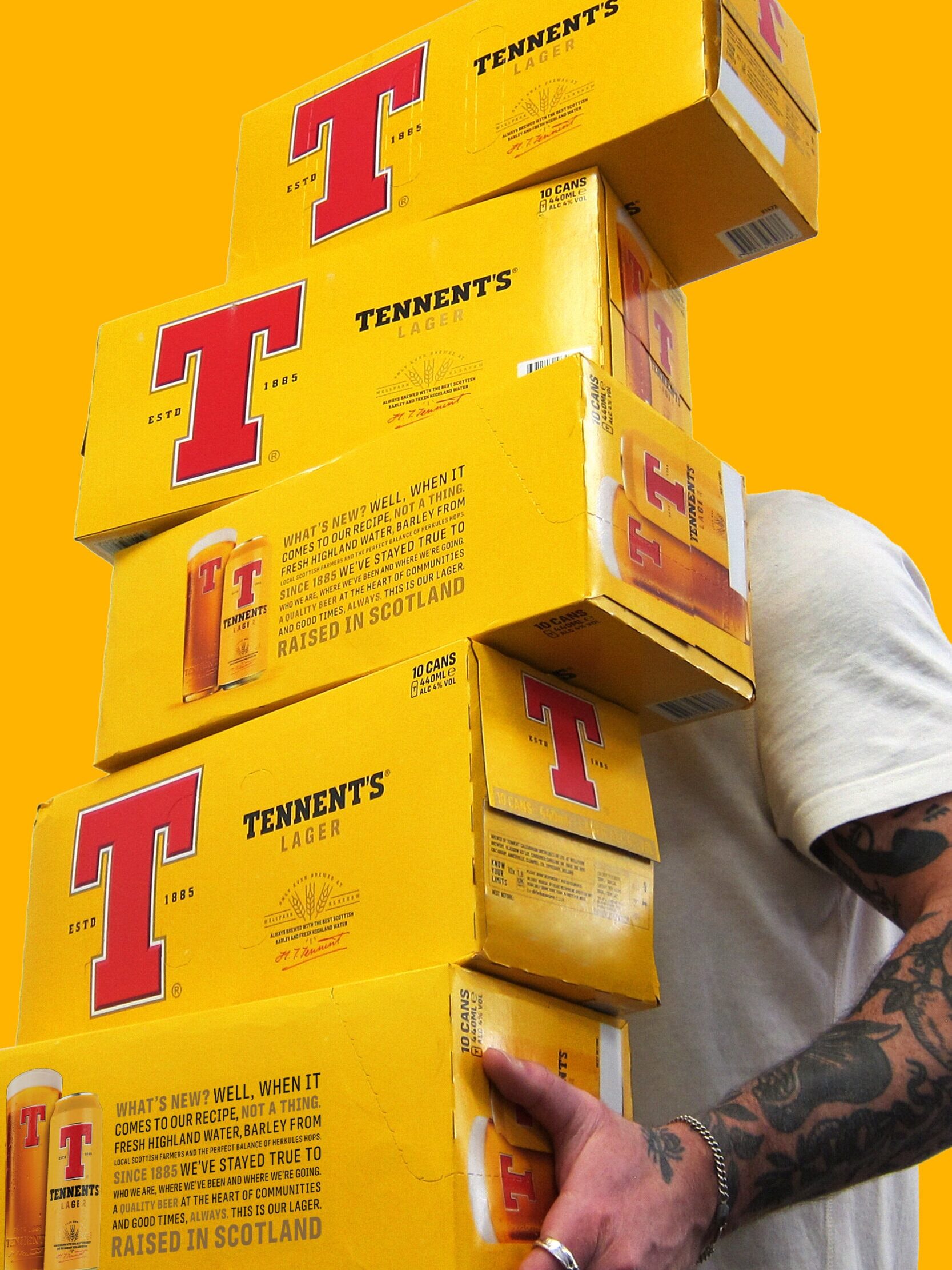
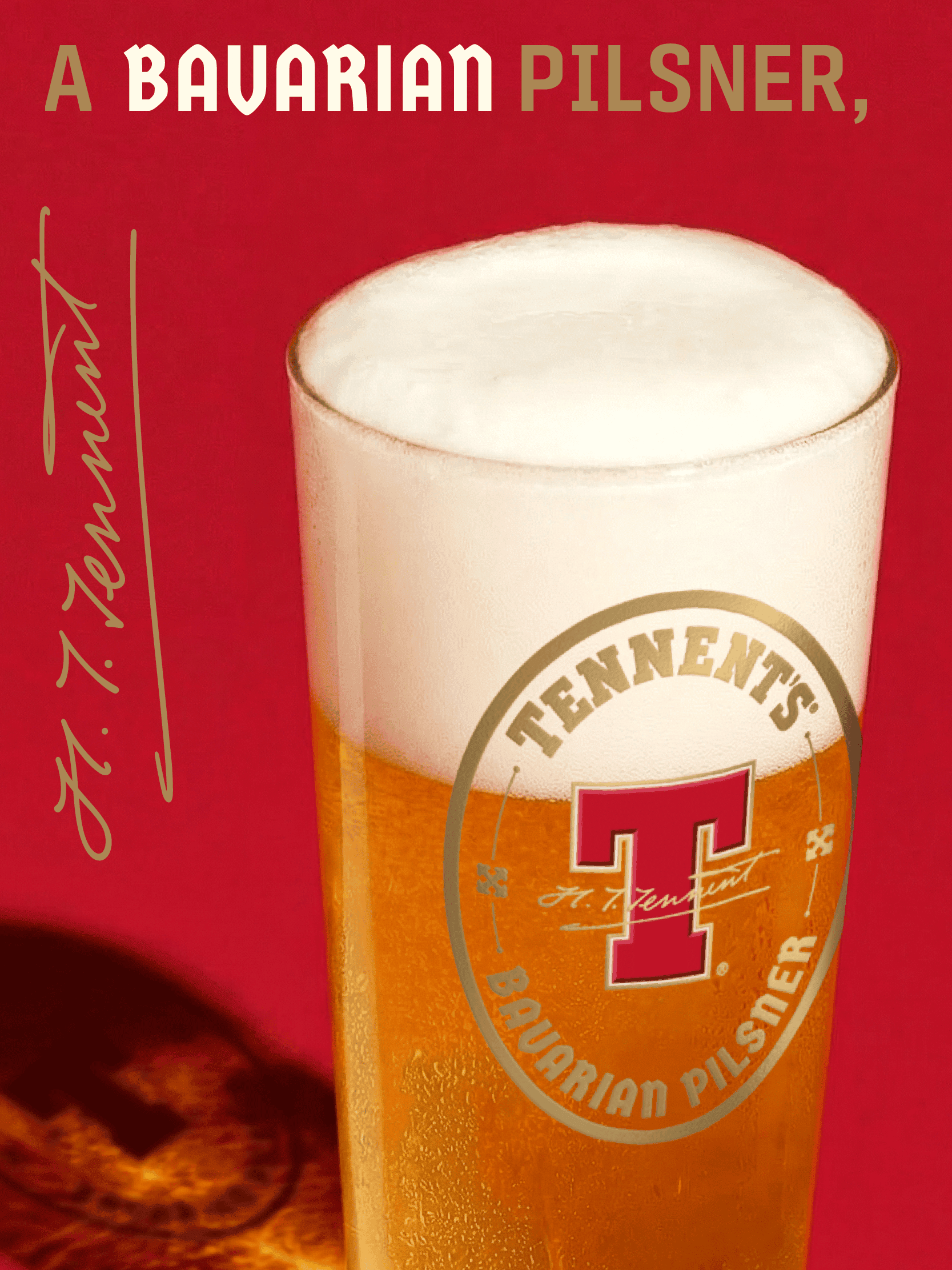
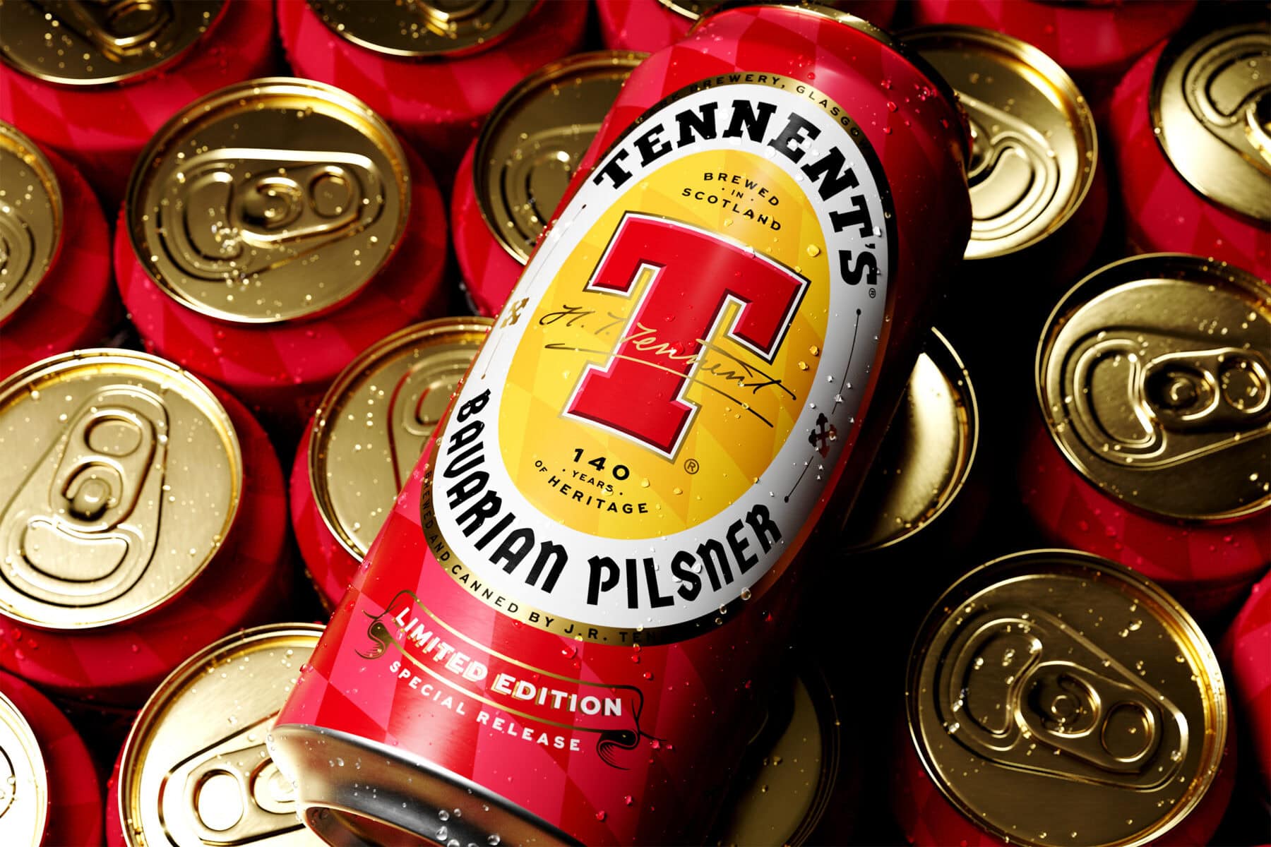
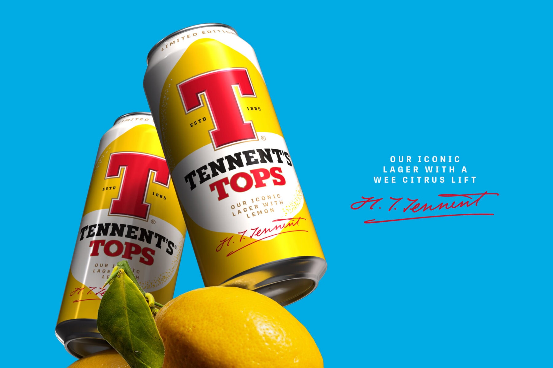
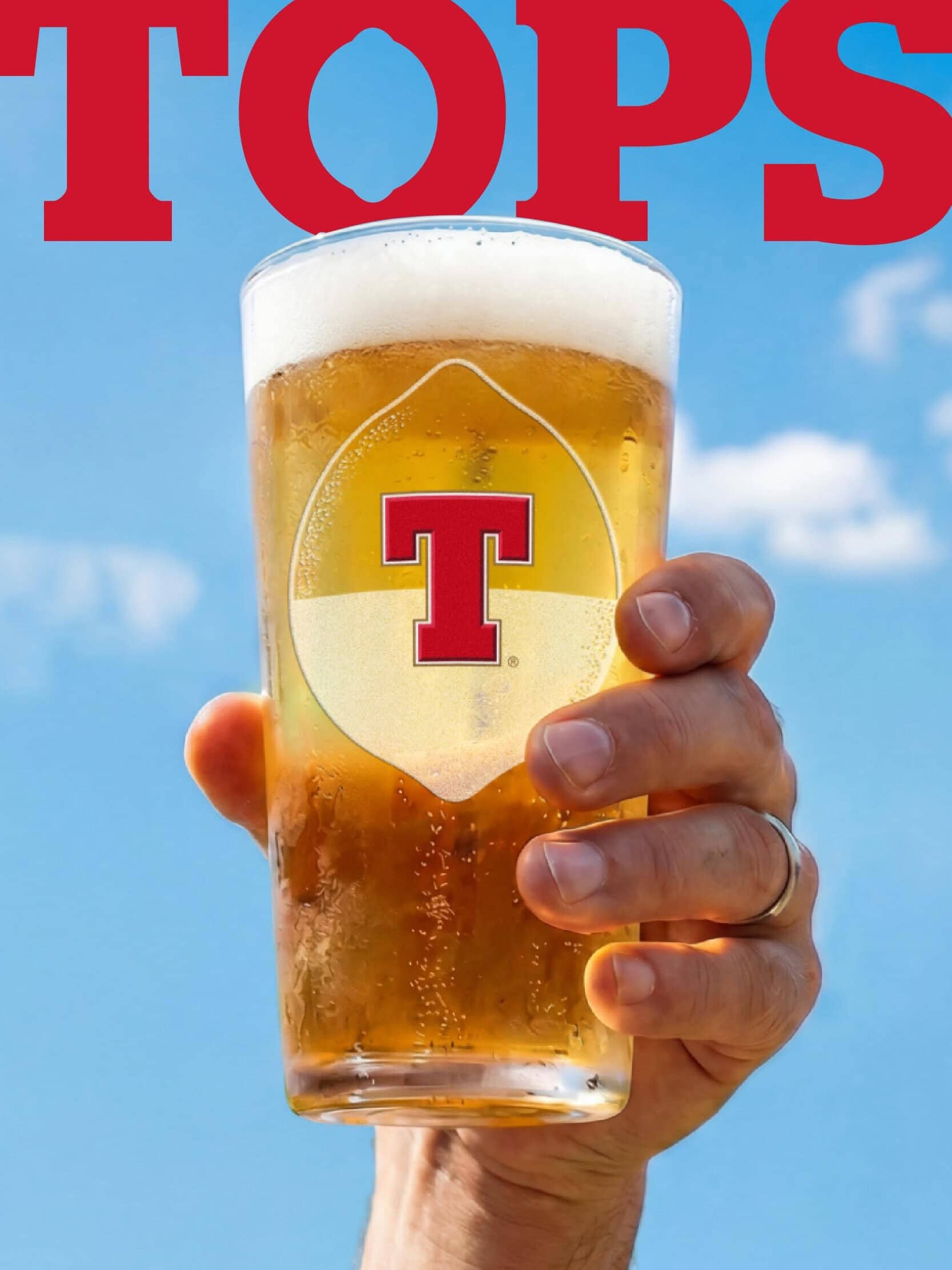
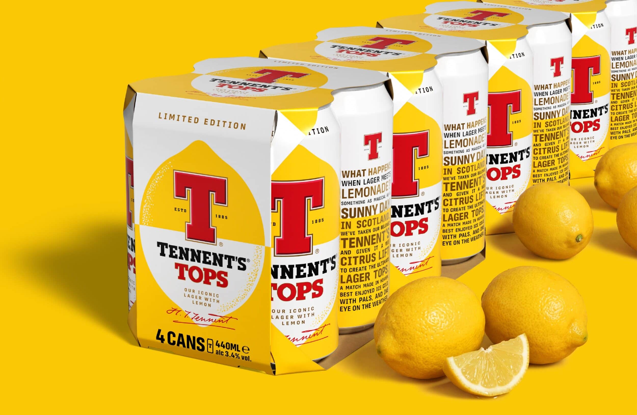
We evolved the identity by amplifying the brand’s most recognisable asset: the iconic red ‘T’. Increasing its scale, refining its construction and adding depth transformed it into a mark that feels bolder, prouder and more contemporary. Richer yellows improved standout on shelf, while refined typography, barley motifs and Hugh Tennent’s signature reintroduced a stronger sense of provenance, craft and authenticity.
Every detail was designed to restore confidence back into the brand. Not through reinvention, but through evolution. What began as a core identity refresh has since evolved into an ongoing creative partnership focused on helping Tennent’s grow beyond its core product and reconnect with new audiences through innovation.
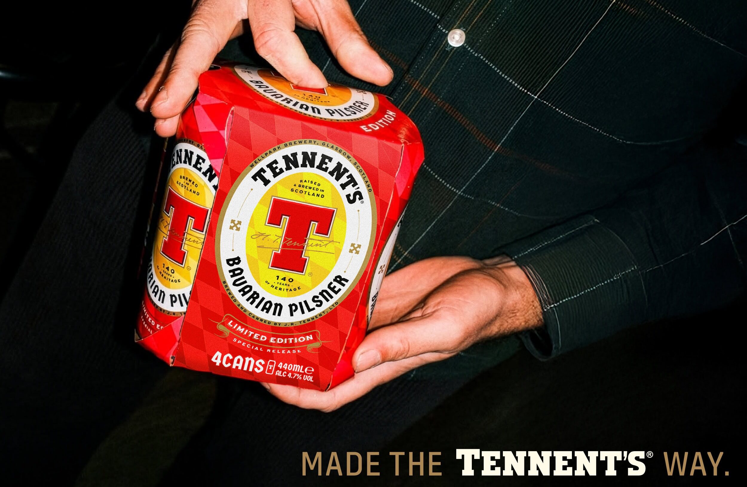
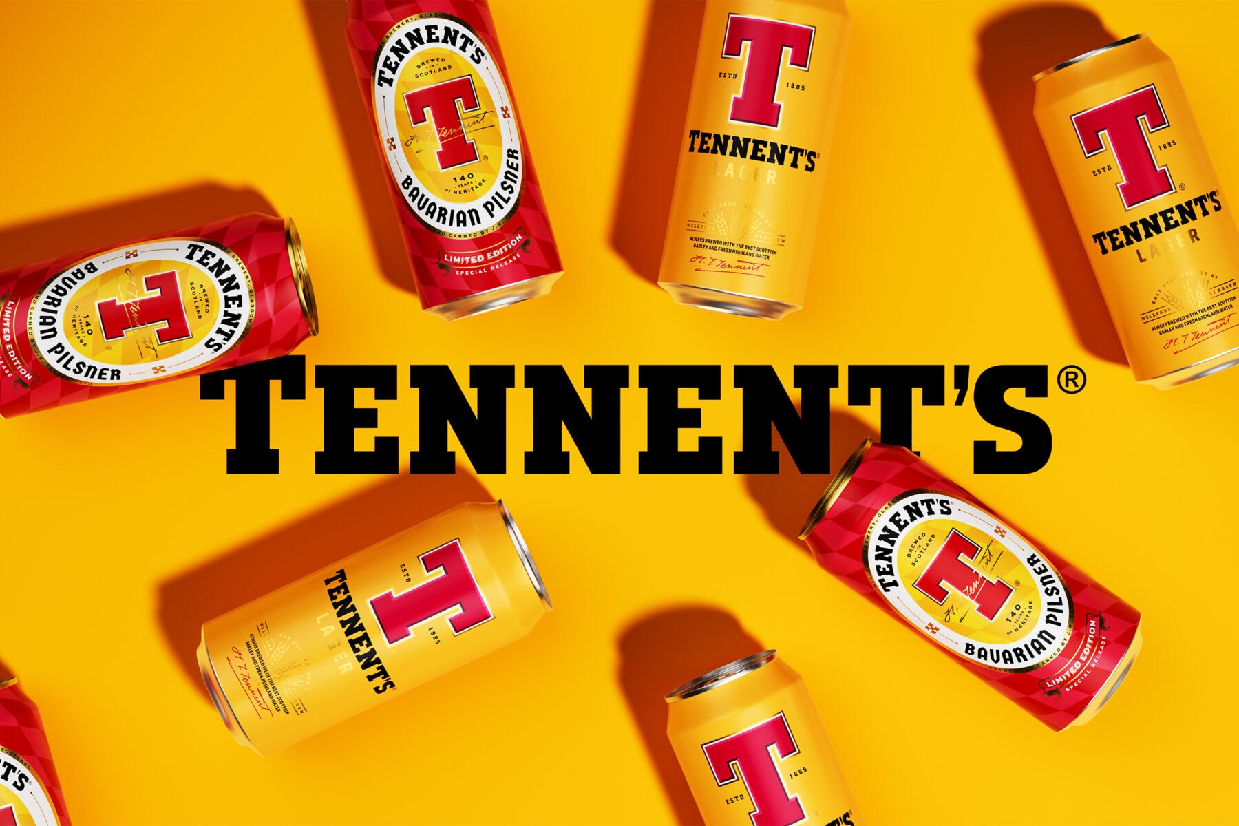
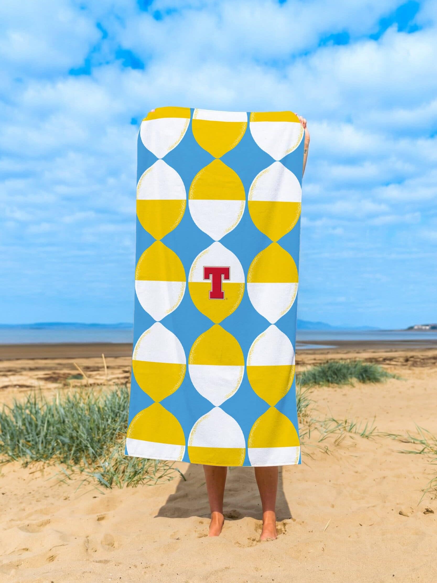
Using the refreshed identity as a foundation, we helped shape a design system capable of stretching into new spaces while remaining unmistakably Tennent’s. This has since led to the launch of Tennent’s Bavarian Pilsner, a limited-edition release inspired by Hugh Tennent’s pioneering trip to Bavaria and the origins of Scottish lager, alongside Tennent’s Tops, a lighter and more playful expression created for new occasions and drinking moments.
Together, these launches demonstrate the strength and flexibility of the system. From premium heritage-inspired innovation to more contemporary cultural occasions, the brand can now evolve confidently while staying true to what made it iconic in the first place.
At a time when beer brands are fighting harder than ever for cultural relevance, Tennent’s is proving that iconic brands don’t need complete reinvention to move forward. Sometimes the most powerful transformations come from refining what people already love and giving it the confidence to lead again.
“The completed work helped the brand drive all-important consumer perceptions of product quality, brand modernity and relevant Scottishness – all key metrics identified within the brief and project.“
Paul Menzies – Marketing Director


Related Work
Explore more work
View allBeats Senses
Press Play on a New Kind of Buzz
Res: Protein Fruit Punch
Fuel for a New Kind of Athlete
Heineken Studio
A Bold Ambition to Innovate in a Changing World
SKYY Vodka
Re-Amplifying SKYY Vodka's Audacious Spirit

Bruichladdich Distillery Co.
Boosting Brand Love, Relevance and Sales
Angostura: Chill
Taking a Caribbean Classic Global
Brooklyn Brewery
Uniting a Global Icon
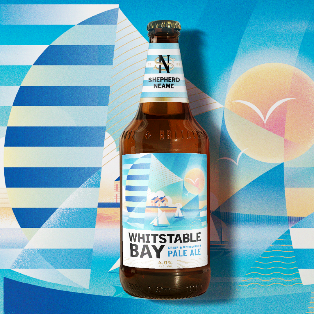
Whitstable Bay, Shepherd Neame’s Iconic Coastal Beer
Bringing new energy to the most recognisable collection from Britain’s oldest brewery.