Belhaven Brewery
Services
- Strategy
- VBI
- Packaging
Bringing out the Best
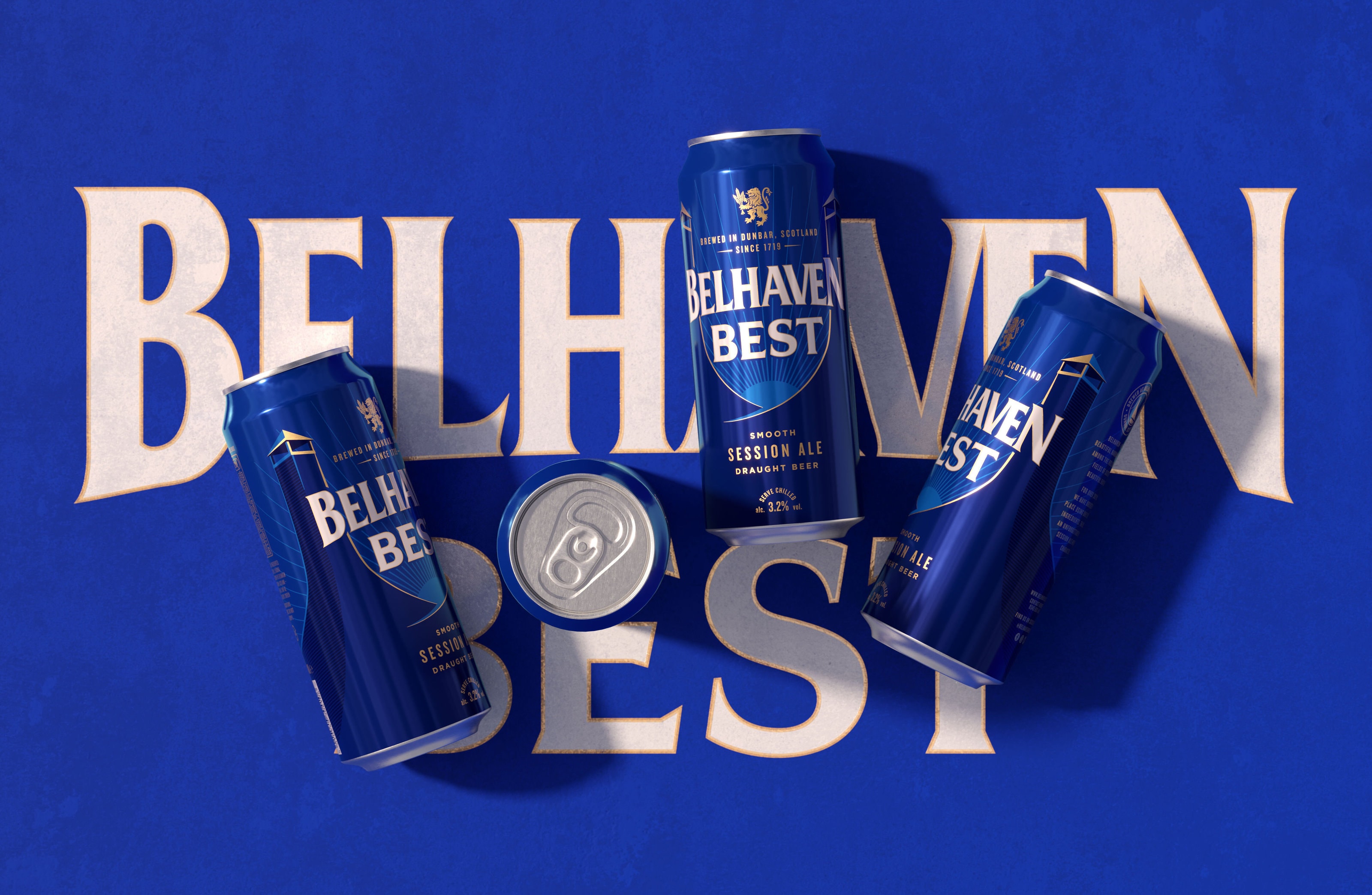
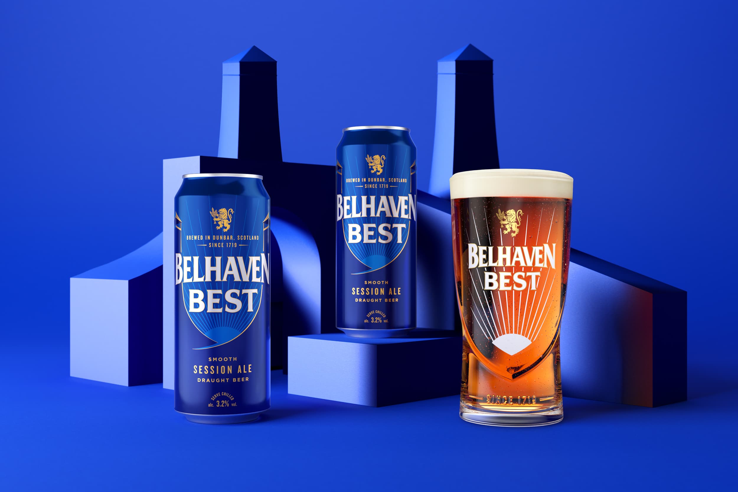
Evolving the brand identity of Scotland’s No 1 ale to defend and grow on and off trade share. Needing to appeal to the next generation whilst not polarising our existing loyal drinkers, we identified a new target audience who appreciate tradition, celebrate progression and seek real easy-going moments. As a beer that champions effortless moments together we needed to inject refreshing confidence, natural simplicity and unmissable vibrancy.
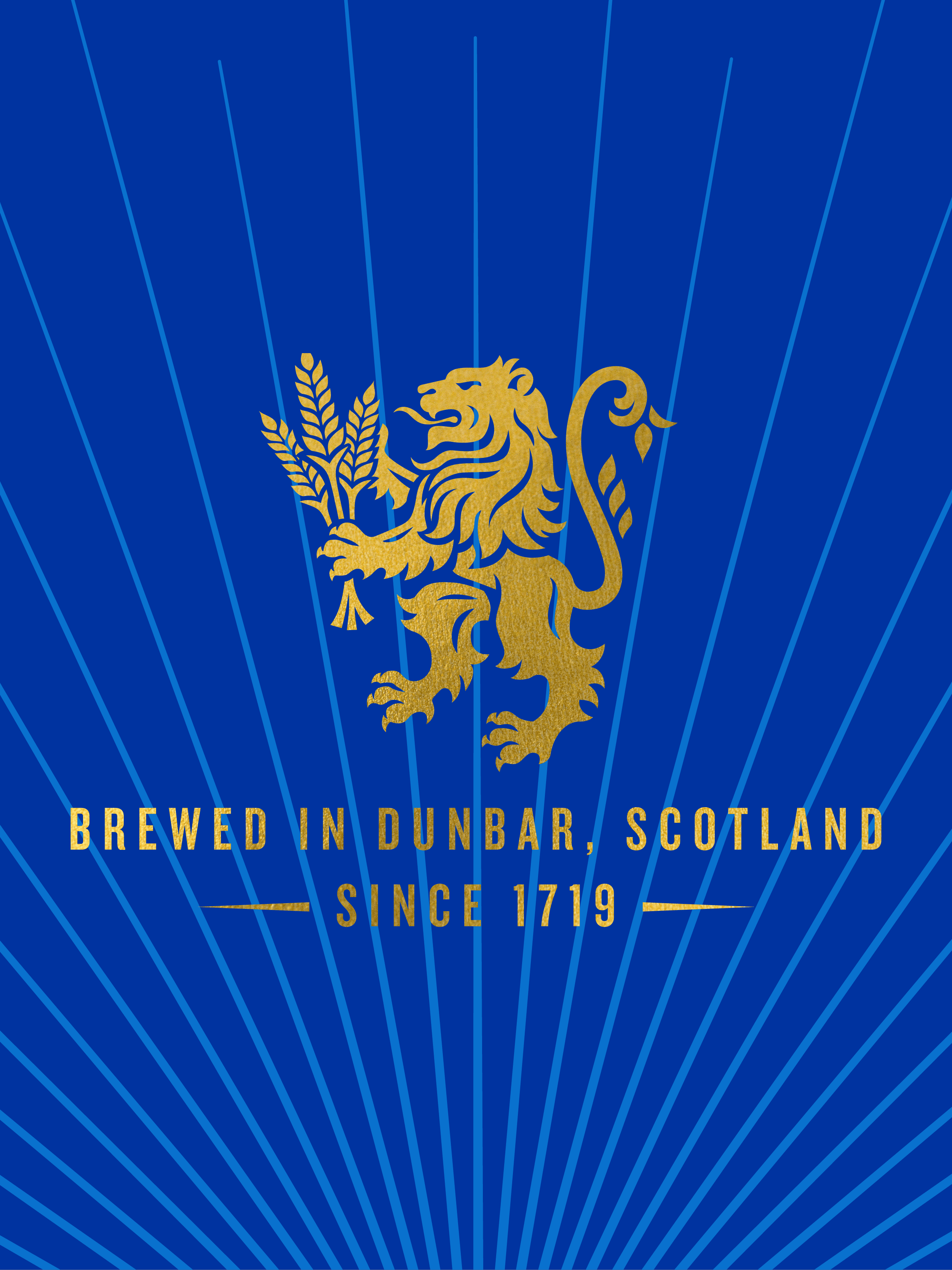
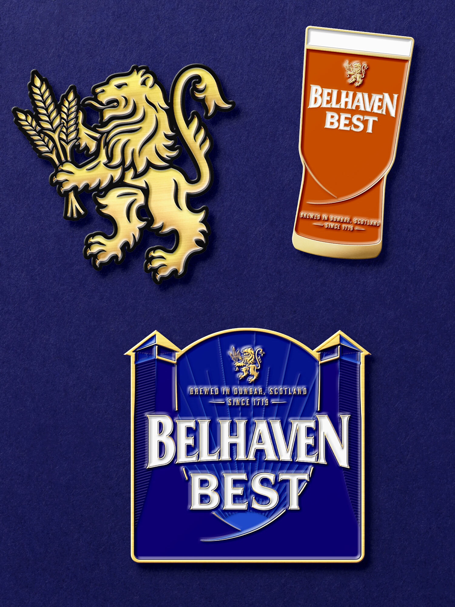
Each element of the visual identity needed to play a role in telling the brand story. The evolved lion is crafted with bold depth and detail to elevate the powerful icon and work at both large and small scales. The reworked lion’s face has adopted a prouder stature and the redrawn handful of barley celebrates malting heritage, with additional barley grains adding character to the tail.
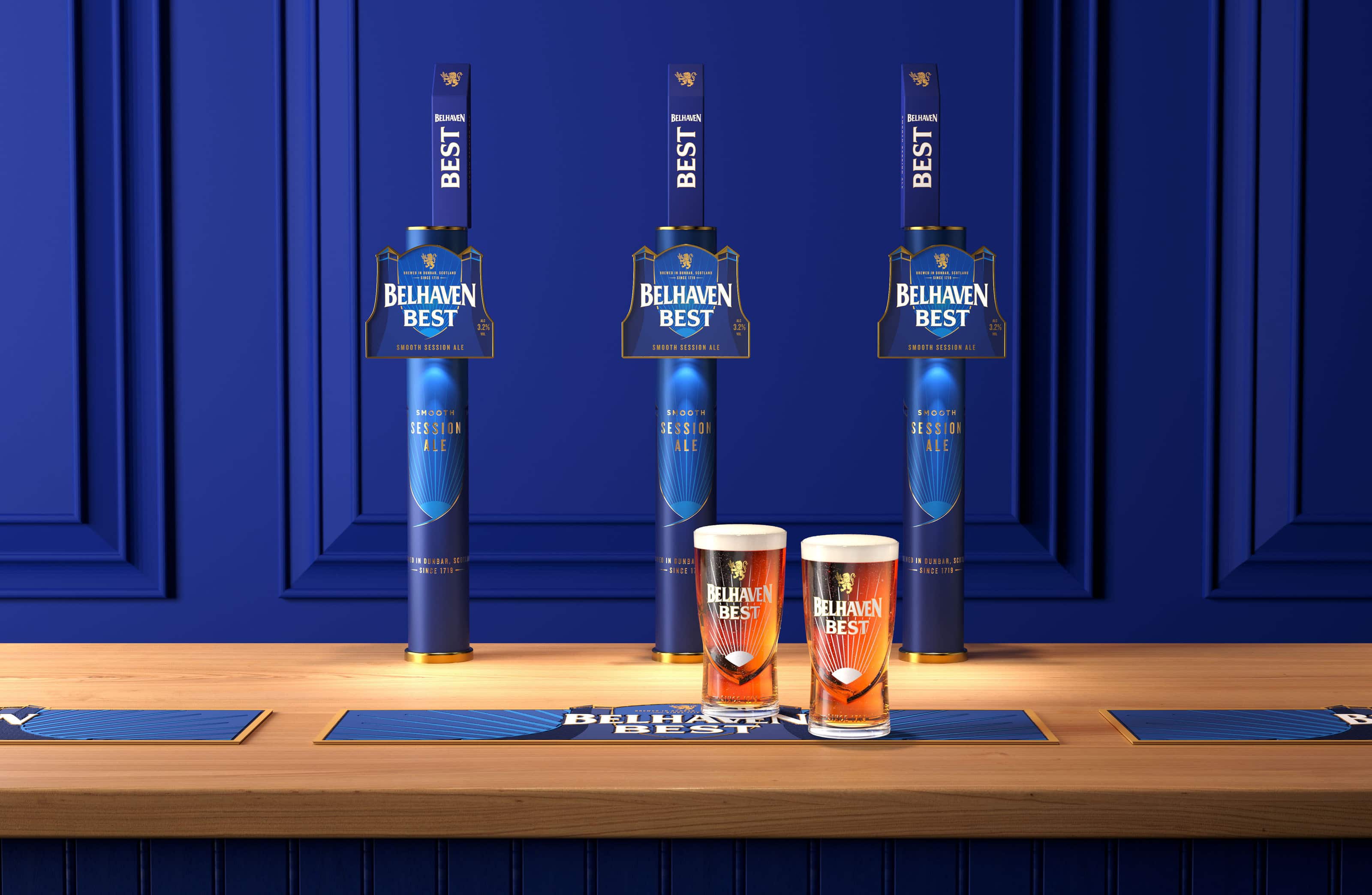
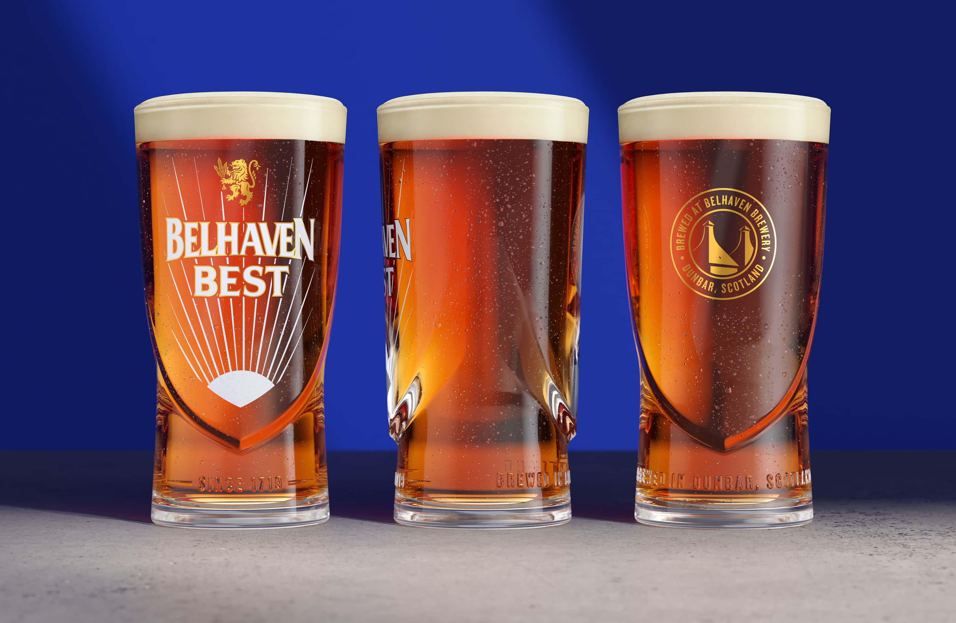
The bespoke glass further captures the brand story, inspired by the current Belhaven half pint glass. The subtle sculpted outline of the chimneys influence the shape of the glass, with an embossed ‘Brewed in Dunbar’ message wrapping around the glass to create a tactile grip that feels great in hand.
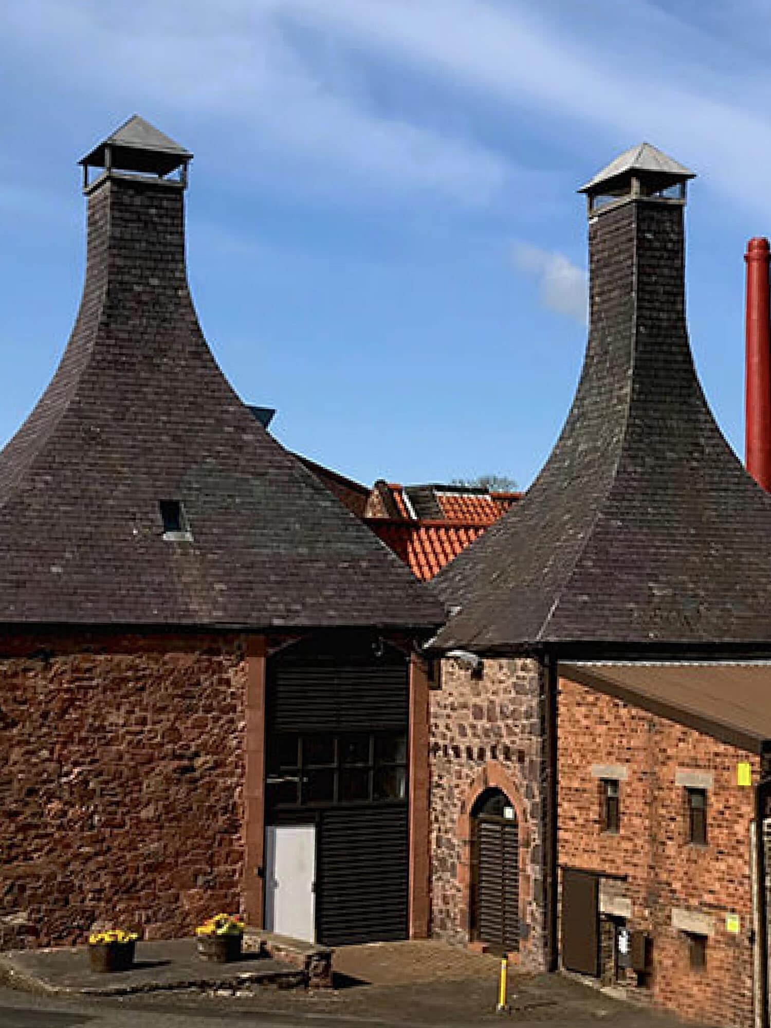
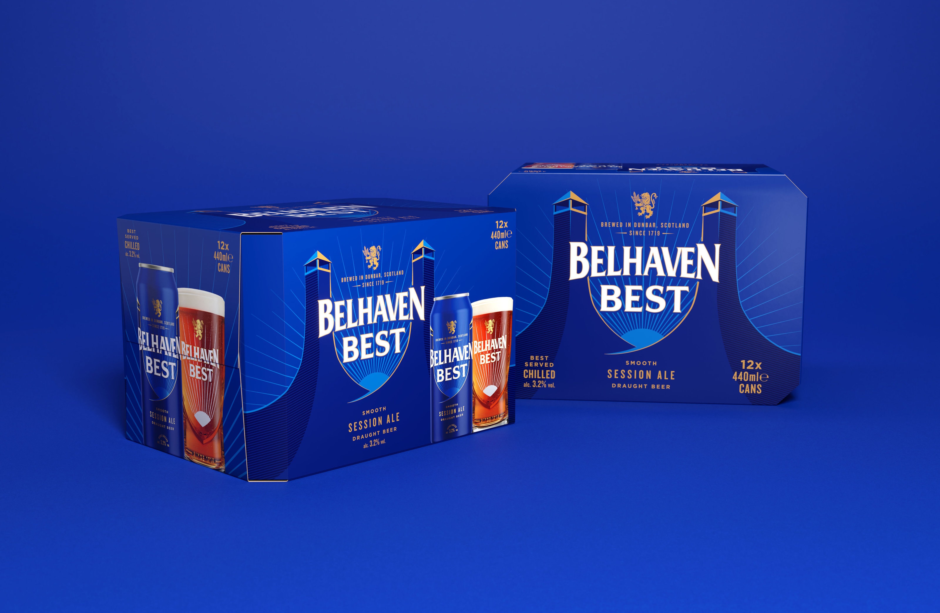
The new ownable blue captures the Scottish element of the brand whilst also providing stand out from other ales in the category. Heritage is celebrated proudly through the depiction of the iconic 300 year old brewery on every touchpoint.
The final detail across the brand identity is the optimistic rays reflecting off the brewery chimneys as a nod to Belhaven’s home by the coast, Dunbar, fondly known as ‘Sunny Dunny.’ Each element of the evolution brings out the Best.


