Tennent’s Lager
Services
- VBI
- Packaging
Refreshing a true Scottish icon
We set out to future-proof Scotland’s best-selling beer by modernising its iconic identity. With a goal to elevate perceived quality, attract new drinkers and retain Tennent’s bold shelf presence, the redesign needed to feel fresh without losing its cultural weight.
This was the first major packaging update since 2018, and the results speak volumes, a 5 percent increase in on-trade market share. A proud new chapter for a brand brewed in the heart of Glasgow since 1885.
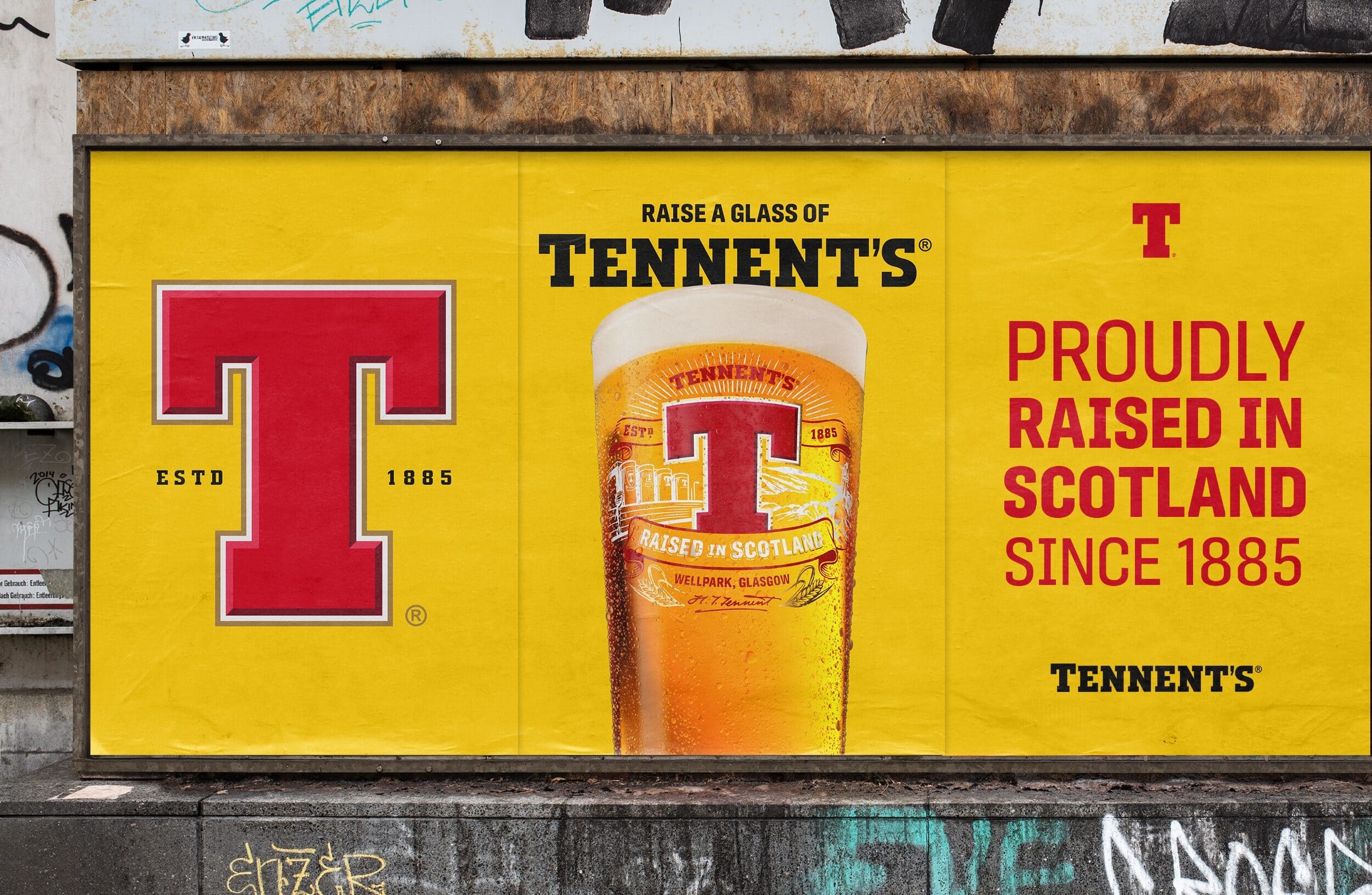
To secure Tennent’s place as Scotland’s most loved lager, we evolved the visual identity in a way that honoured its heritage while confidently stepping into the future. Drawing on Wellpark Brewery’s commitment to local ingredients, sustainability and community, we built a design rooted in pride, provenance and modern craft.
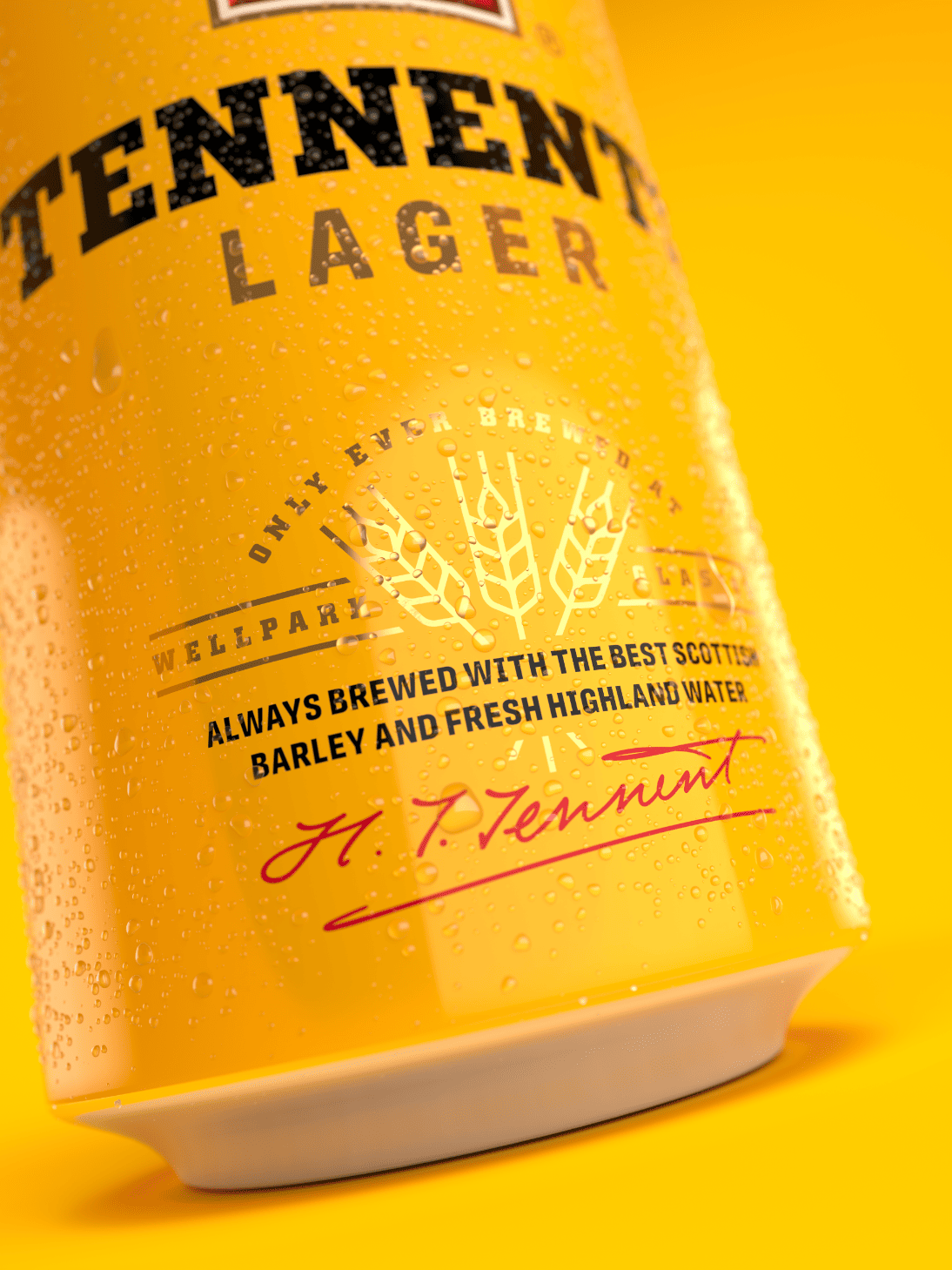
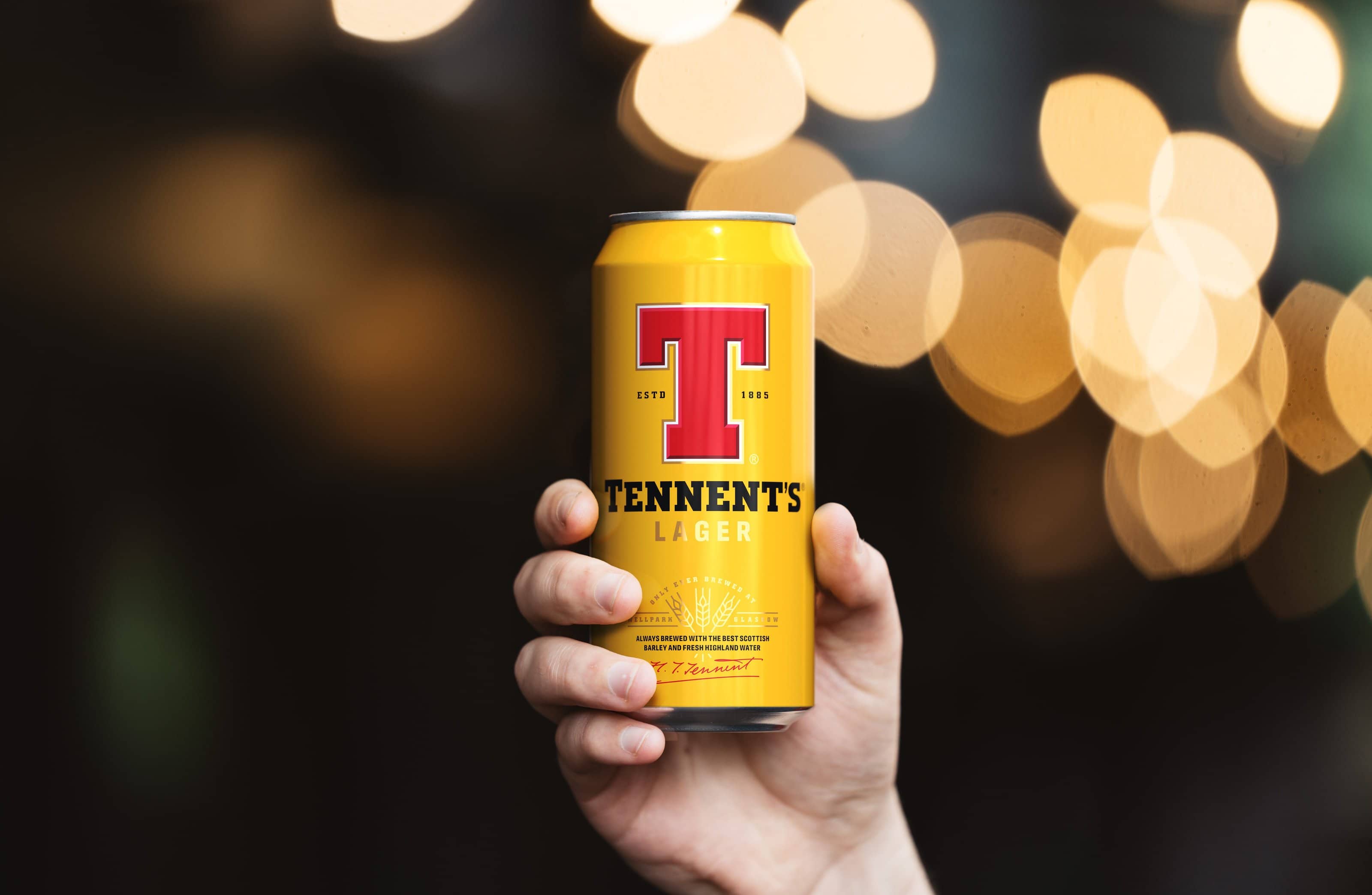
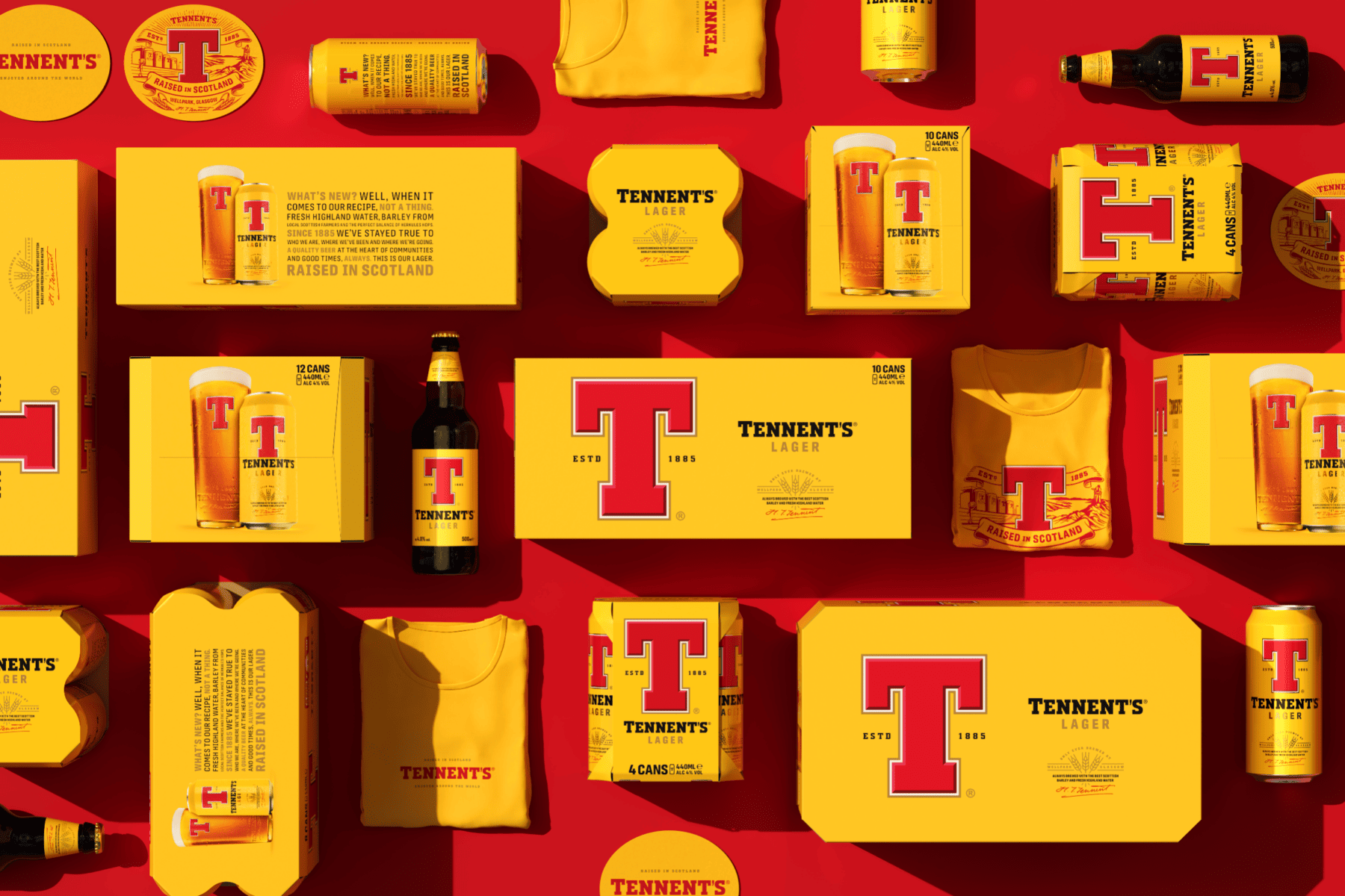
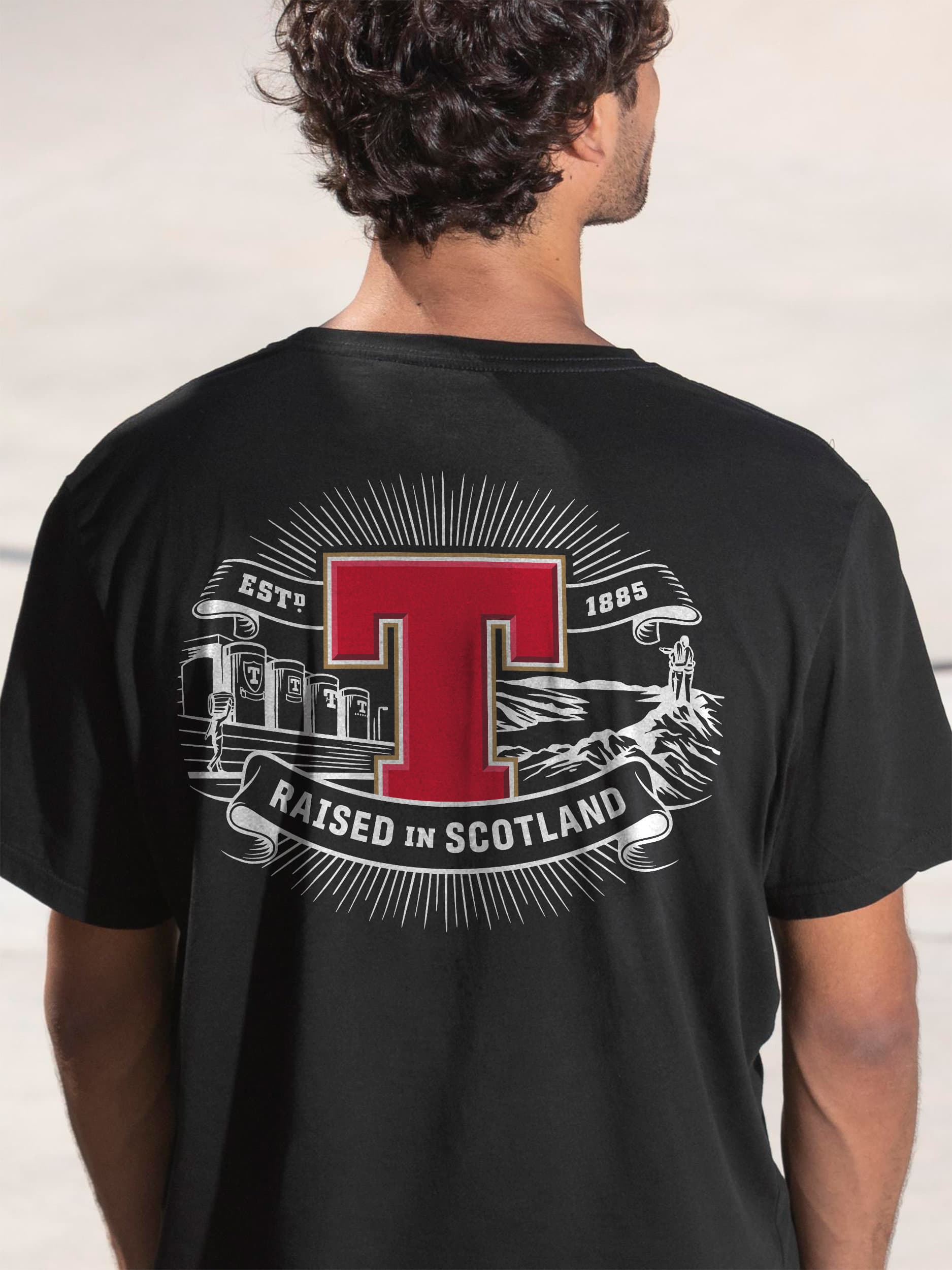
A richer yellow backdrop now amplifies the iconic red ‘T’, while new bevelled keylines add depth and quality. We introduced refined cues: barley motifs, Hugh Tennent’s signature and custom illustrations by Tobias Hall, to bring storytelling and tactility to every touchpoint.
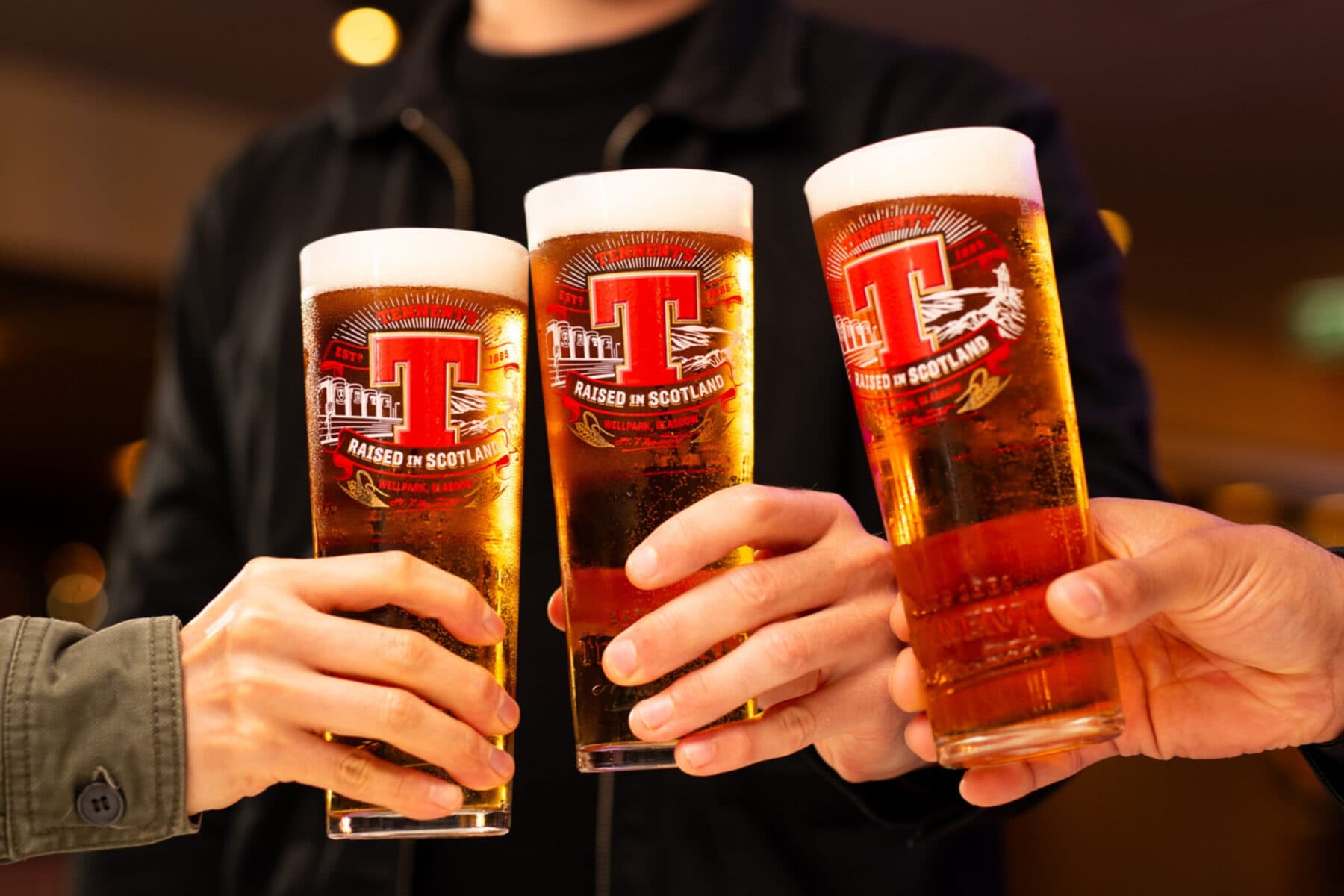
The updated identity spans packaging, glassware and beyond, elevating Tennent’s with quiet confidence. It’s a bold evolution of a Scottish icon, true to its roots, ready for what’s next.
“The completed work helped the brand drive all-important consumer perceptions of product quality, brand modernity and relevant Scottishness – all key metrics identified within the brief and project.“
Paul Menzies – Marketing Director
Related Work
Explore more work
View allBeats Senses
Press Play on a New Kind of Buzz
Res: Protein Fruit Punch
Fuel for a New Kind of Athlete
Heineken Studio
A Bold Ambition to Innovate in a Changing World
SKYY Vodka
Re-Amplifying SKYY Vodka's Audacious Spirit
Bruichladdich Distillery Co.
Boosting Brand Love, Relevance and Sales
Angostura: Chill
Taking a Caribbean Classic Global
Brooklyn Brewery
Uniting a Global Icon
Whitstable Bay, Shepherd Neame’s Iconic Coastal Beer
Bringing new energy to the most recognisable collection from Britain’s oldest brewery.
Bruichladdich Distillery Co.
Redefining Luxury. Redefining Age.