Breuckelen Distilling
Services
- VBI
- Packaging
Redefining Local Craft for a Wider Stage
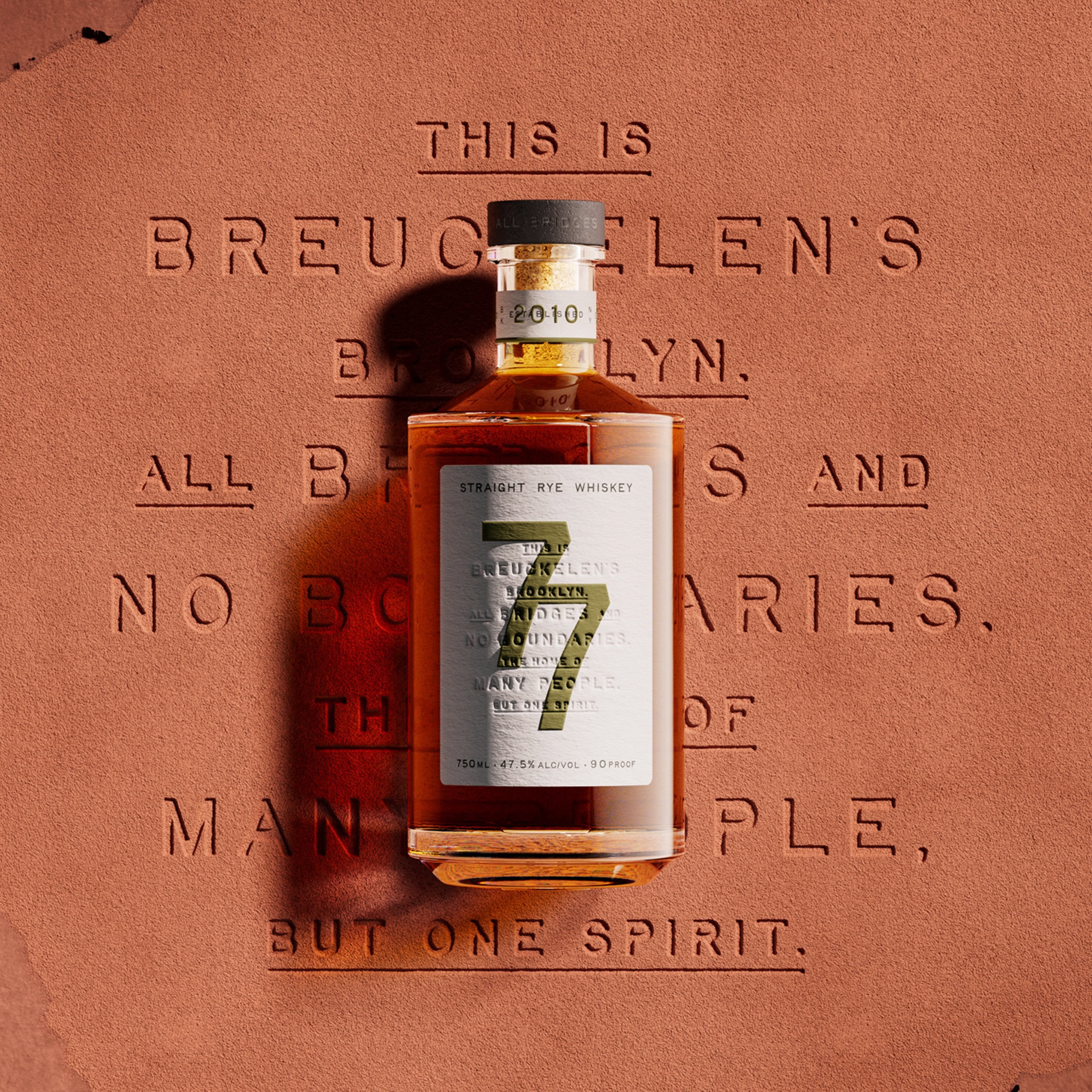
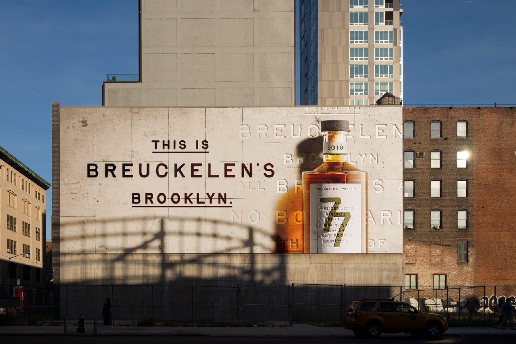
Breuckelen Distilling came to us with bold ambitions: to take on the whiskey world from their Brooklyn base. They needed a refreshed identity and packaging for 77 Whiskey that could stand tall in their own backyard, and resonate far beyond it. The challenge was to capture Brooklyn’s spirit in a way that felt both proudly local and globally iconic.
Drawing on the distillery’s name, Breuckelen, the original Dutch spelling of Brooklyn, we set out to reflect the borough’s layered history, vibrant creativity, and unbreakable sense of community. A place built on tradition and reinvention. A whiskey brand ready to show the world what Brooklyn is truly made of.
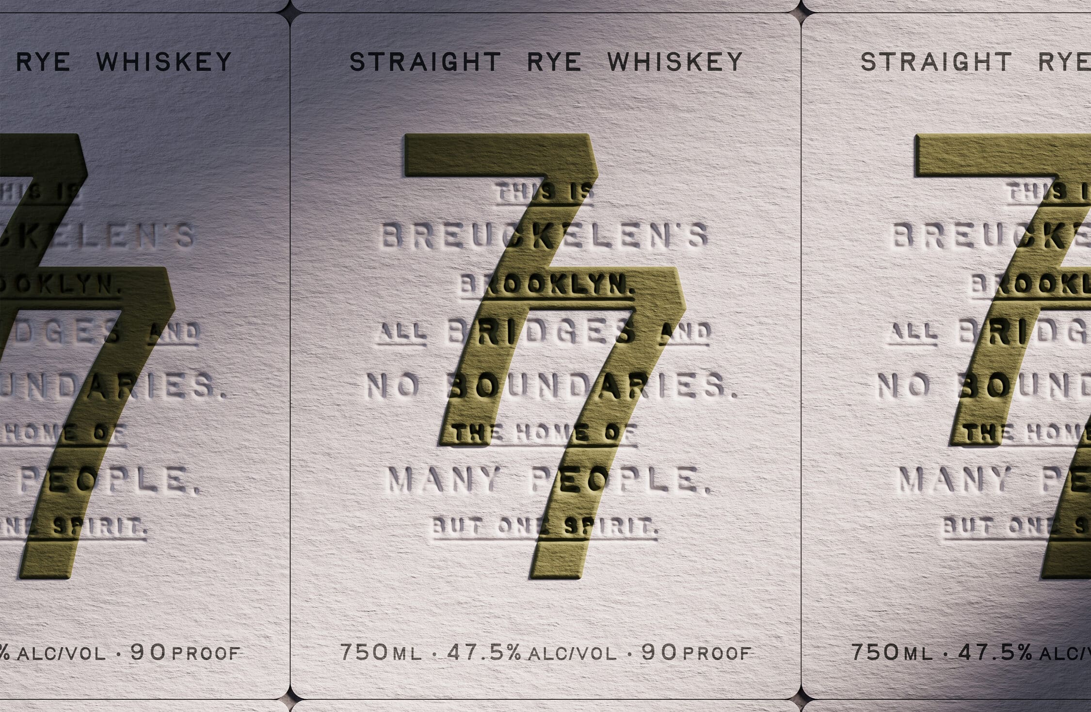
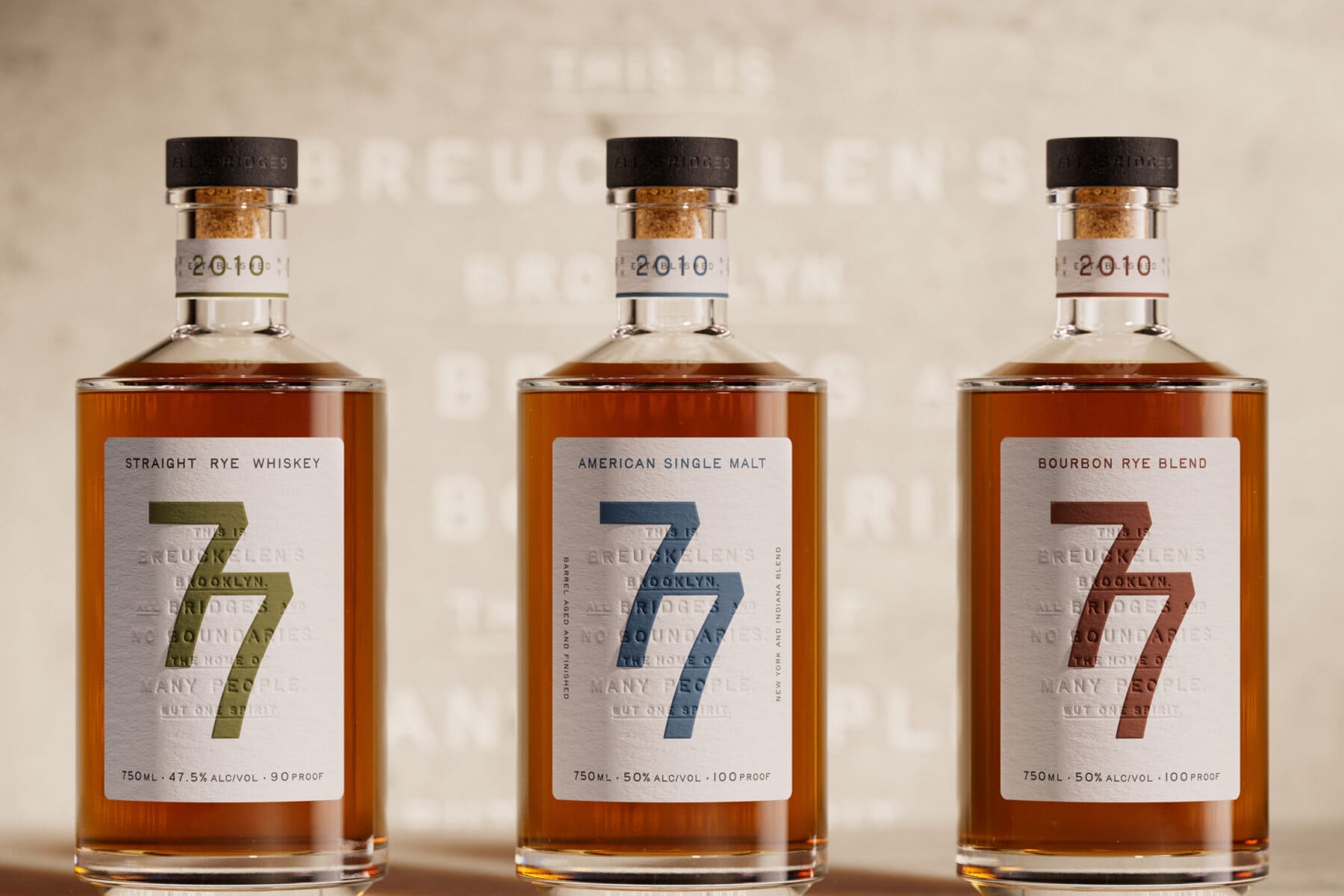
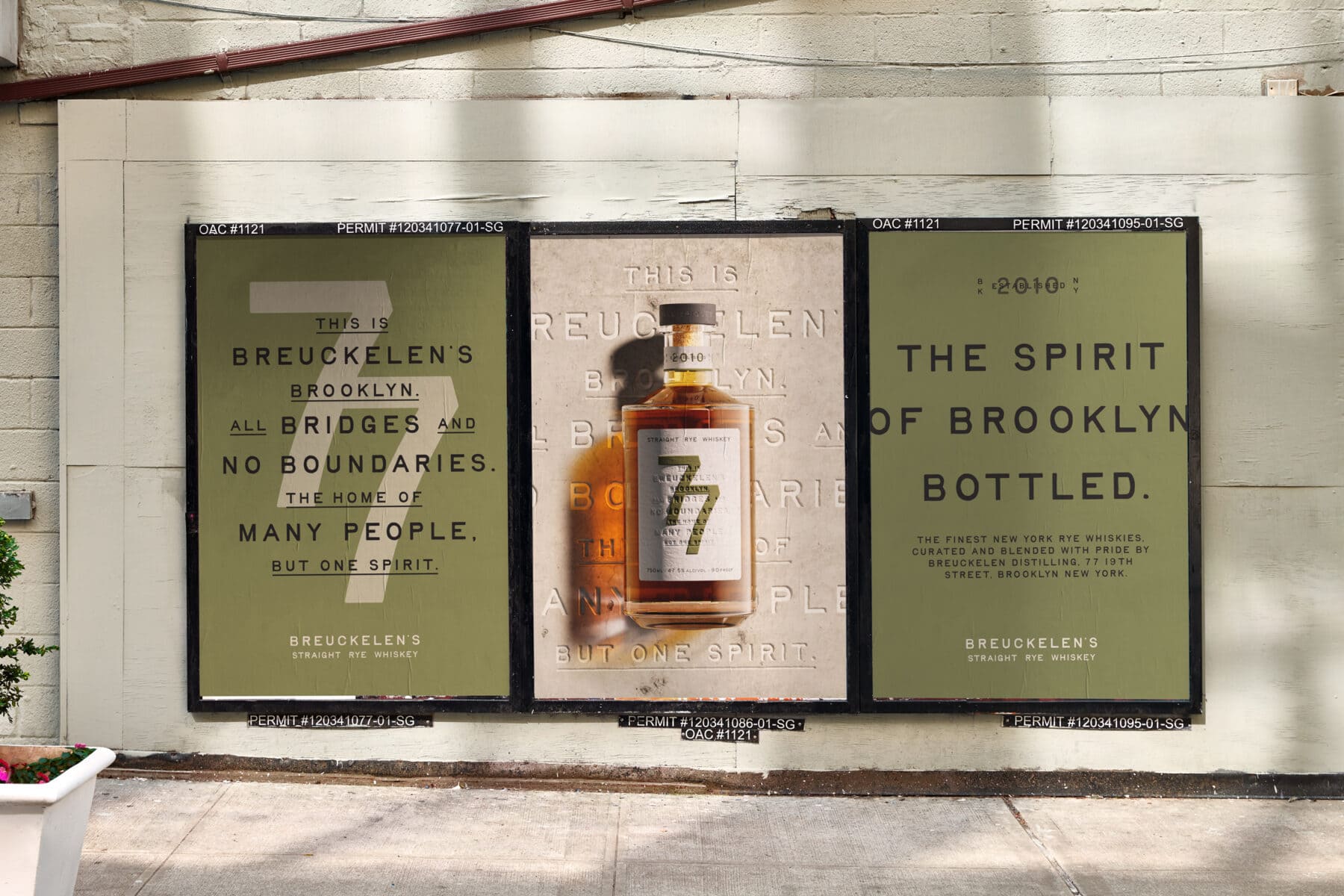
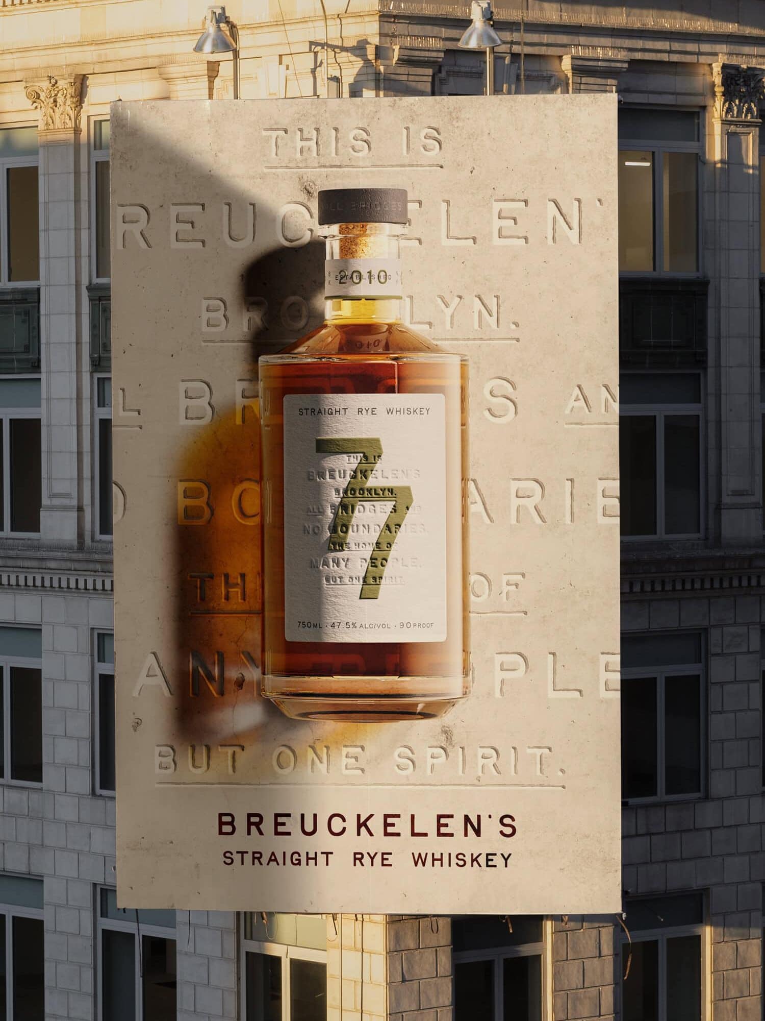
Our design approach paired Brooklyn’s iconic past with bold modernity. Inspired by the borough’s blend of grit and craft, we took cues from the Brooklyn Bridge’s brass plaques to develop a tactile, typographic system that feels raw yet refined. The bold “77” anchors the design, delivering standout bar presence and brand recall.
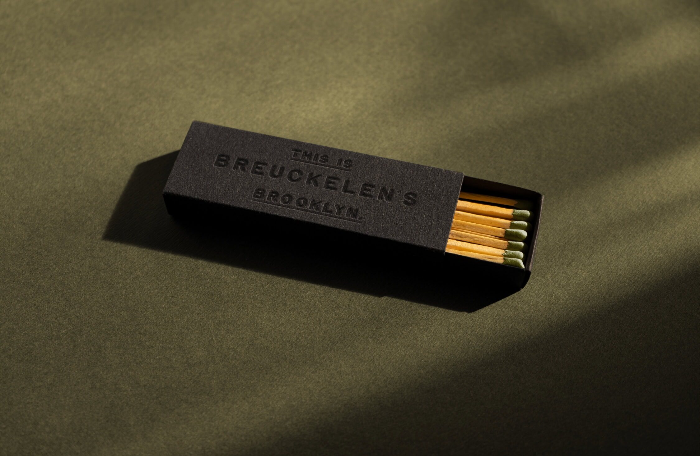
The selected bottle structure adds modern elegance, while print finishes, from embossed labels to a textured stopper, communicate Brooklyn’s industrious spirit. The creative culture of places like the Domino Sugar building helped inspire a look that feels both rooted and forward-facing.
The result is a regenerated identity for 77 Whiskey, confident, characterful, and unmistakably Brooklyn.
Related Work
Explore more work
View allBeats Senses
Press Play on a New Kind of Buzz
Res: Protein Fruit Punch
Fuel for a New Kind of Athlete
Heineken Studio
A Bold Ambition to Innovate in a Changing World
SKYY Vodka
Re-Amplifying SKYY Vodka's Audacious Spirit
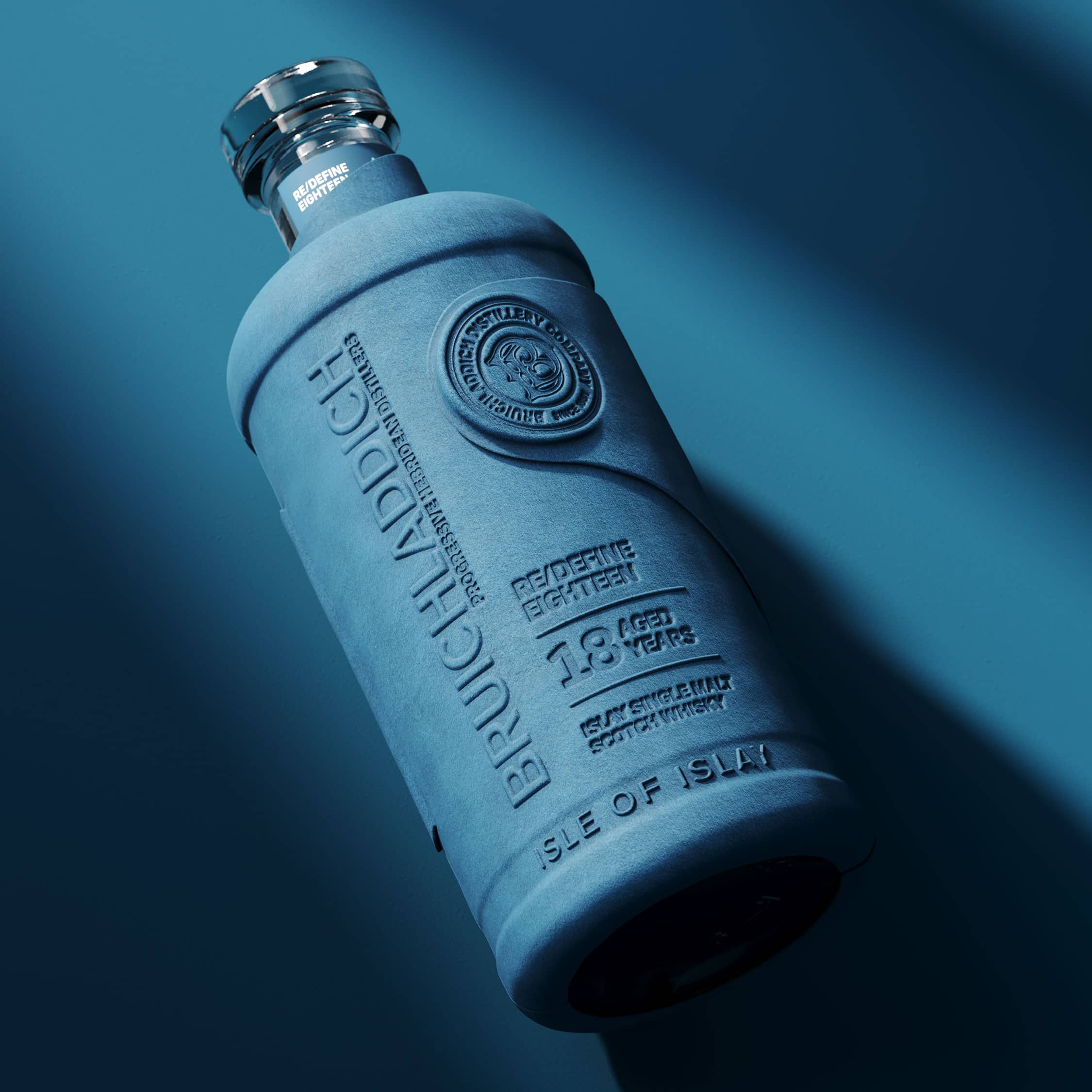
Bruichladdich Distillery Co.
Boosting Brand Love, Relevance and Sales
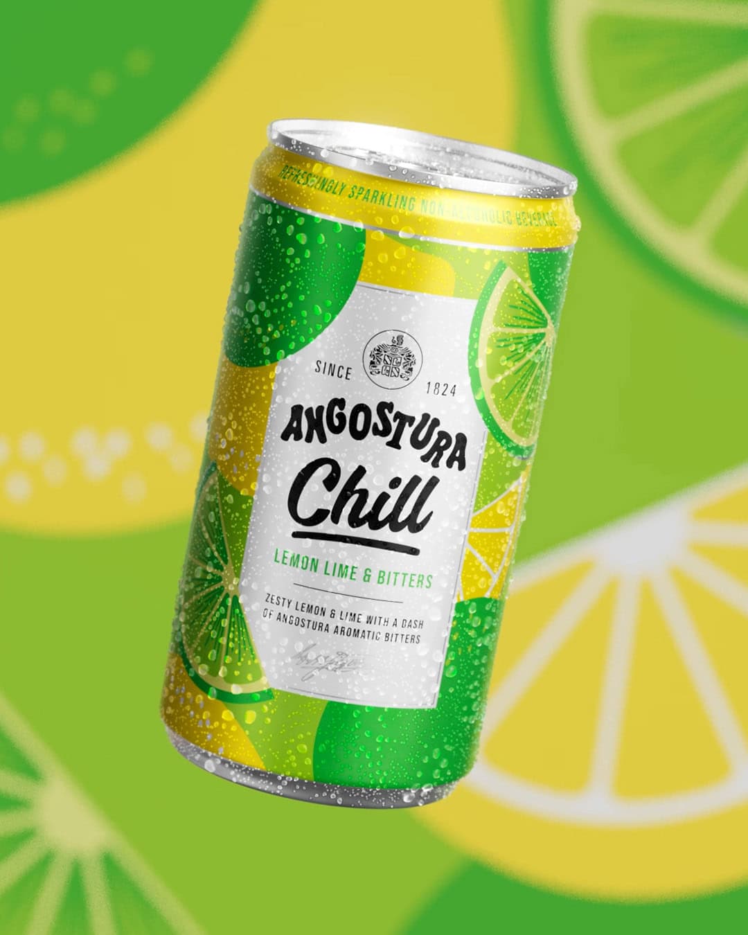
Angostura: Chill
Taking a Caribbean Classic Global
Brooklyn Brewery
Uniting a Global Icon
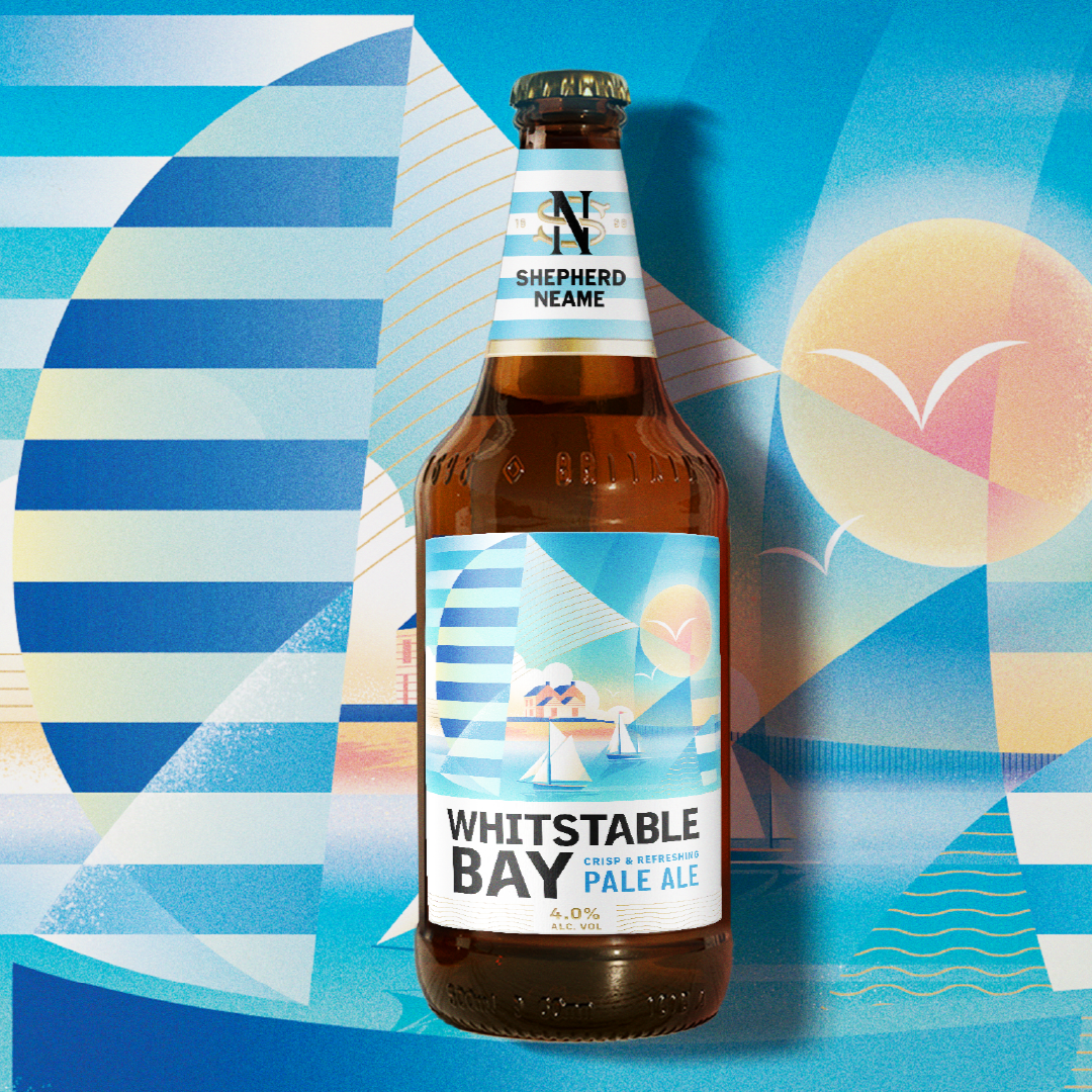
Whitstable Bay, Shepherd Neame’s Iconic Coastal Beer
Bringing new energy to the most recognisable collection from Britain’s oldest brewery.