Snazzy: giving an award-winning cocktail a brand to match
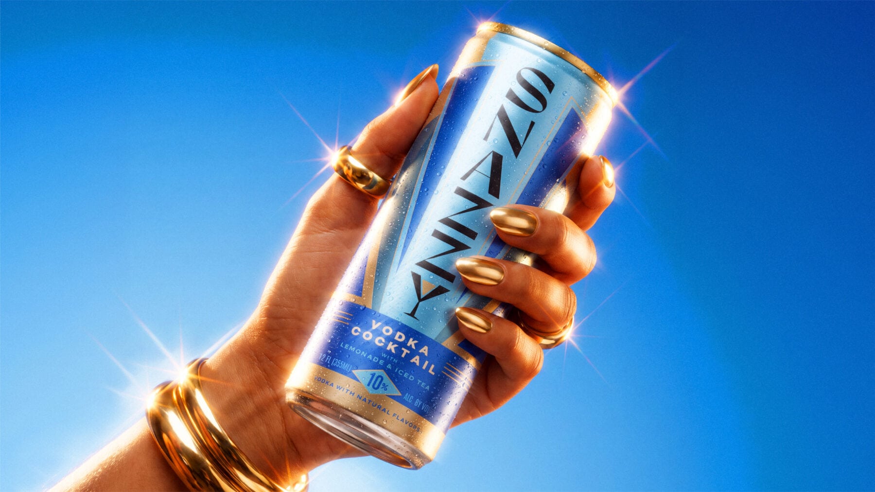
Snazzy had already got the most important thing right: the drink.
Inspired by the classic American Arnold Palmer, Snazzy takes the familiar combination of iced tea and lemonade and brings spirits into the mix, with whiskey, vodka, tequila and rum expressions. The idea has its roots in founder David Peterson’s childhood summers in Napa, making lemonade from lemons picked in his grandmother’s garden. Years later, his love of half iced tea and half lemonade led him to experiment with adding different spirits. That personal recipe eventually became Snazzy.
And people were already paying attention. The liquid has been recognised by the San Francisco Ready-to-Drink Competition, SIP Awards and RTD Magazine, with honours including Best of Class, Double Gold and Editor’s Choice. Its Whiskey Half & Half Cocktail was also named Best Whisk(e)y-Based RTD at the 2025 Top Shelf Awards.
The liquid was working hard. We needed to make the brand work just as hard.
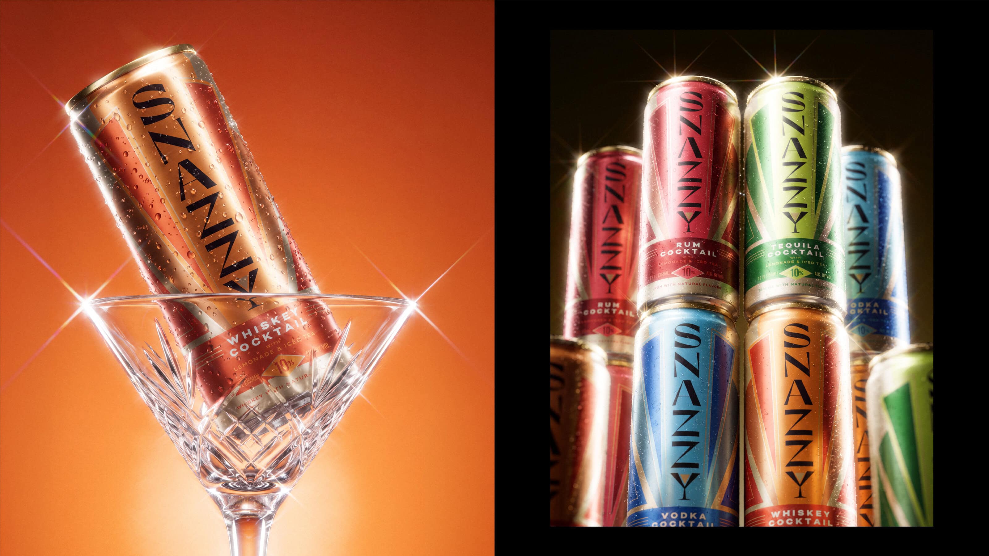
RTD is a busy place to be. Snazzy needed an identity that could command more attention, communicate the quality of what was inside the can and give the business something it could continue to build from as it grew.Working with David, we rebuilt the identity around a clearer, more confident idea, creating a visual world with enough personality to make Snazzy memorable while bringing the different expressions together as one cohesive brand.
Our creative idea, Dazzling Decadence, takes its cues from a modern Gatsby world: Roaring Twenties glamour, celebration and indulgence, with a distinctly Snazzy sense of fun. Art Deco-inspired geometry gives the identity its structure, while expressive typography, gold in abundance and bright colour dial up the theatre. At the centre is a new Snazzy wordmark, giving the brand a recognisable signature across the range. Colour works hard too. Each expression has its own palette, helping to cue the different spirits and giving individual cans their own character, while making sure the full range hangs together as one brand.
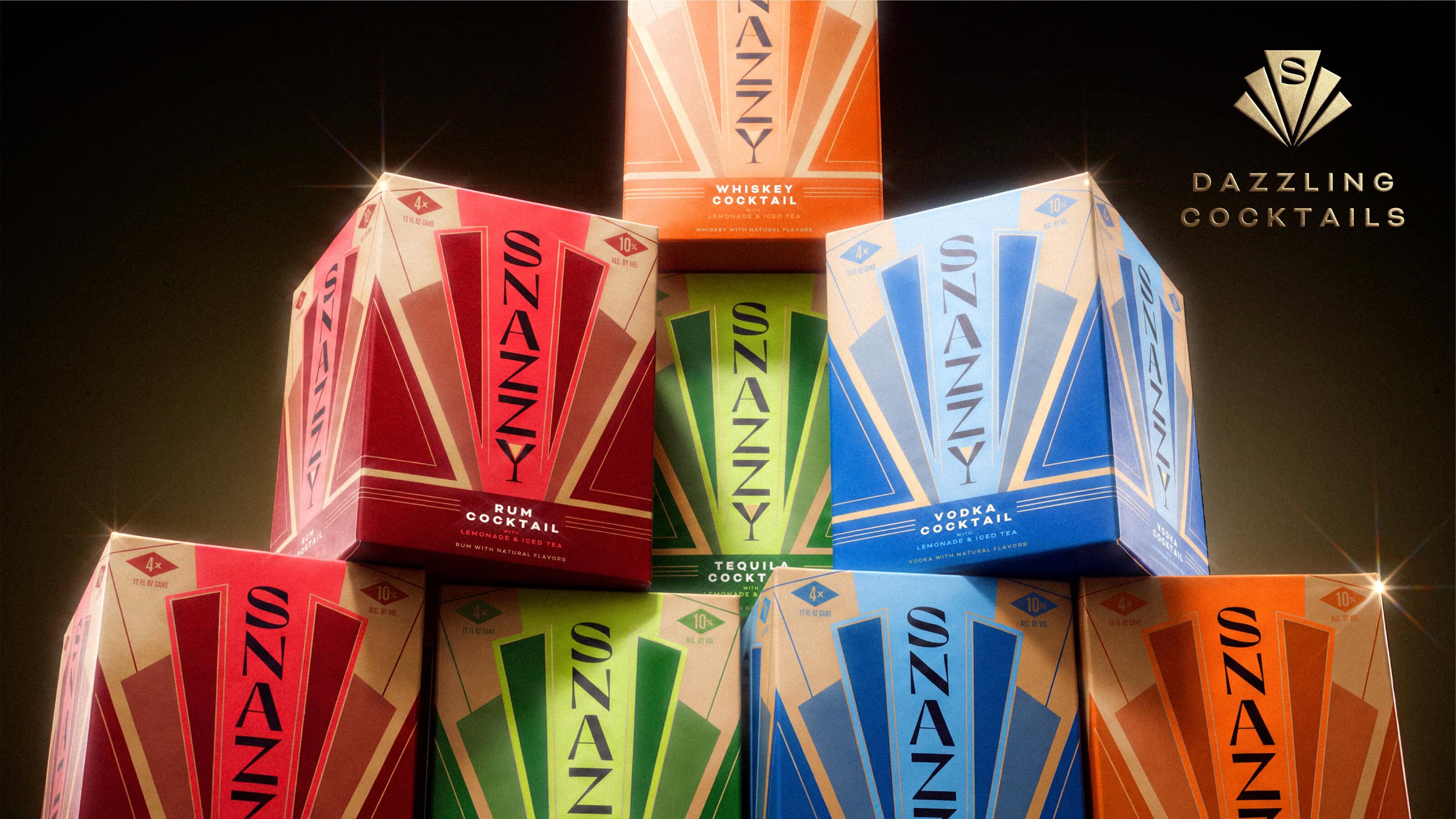
For all the glamour and decadence, Snazzy was never supposed to become too polished or precious. This is a canned cocktail designed to be enjoyed, and the identity needed to retain that sense of fun.
As our Design Director Glenn Thorpe puts it: “We wanted Snazzy to feel like a modern Gatsby: full of Roaring Twenties decadence and theatre, but never too serious. Art Deco gave us a strong visual world to build from, and our creative idea, ‘Dazzling Decadence’, gave it the Snazzy spin. Gold in abundance and bright colour help the brand stand out while keeping the range feeling cohesive. It gives Snazzy more presence and personality, while keeping the fun at the heart of the brand.”
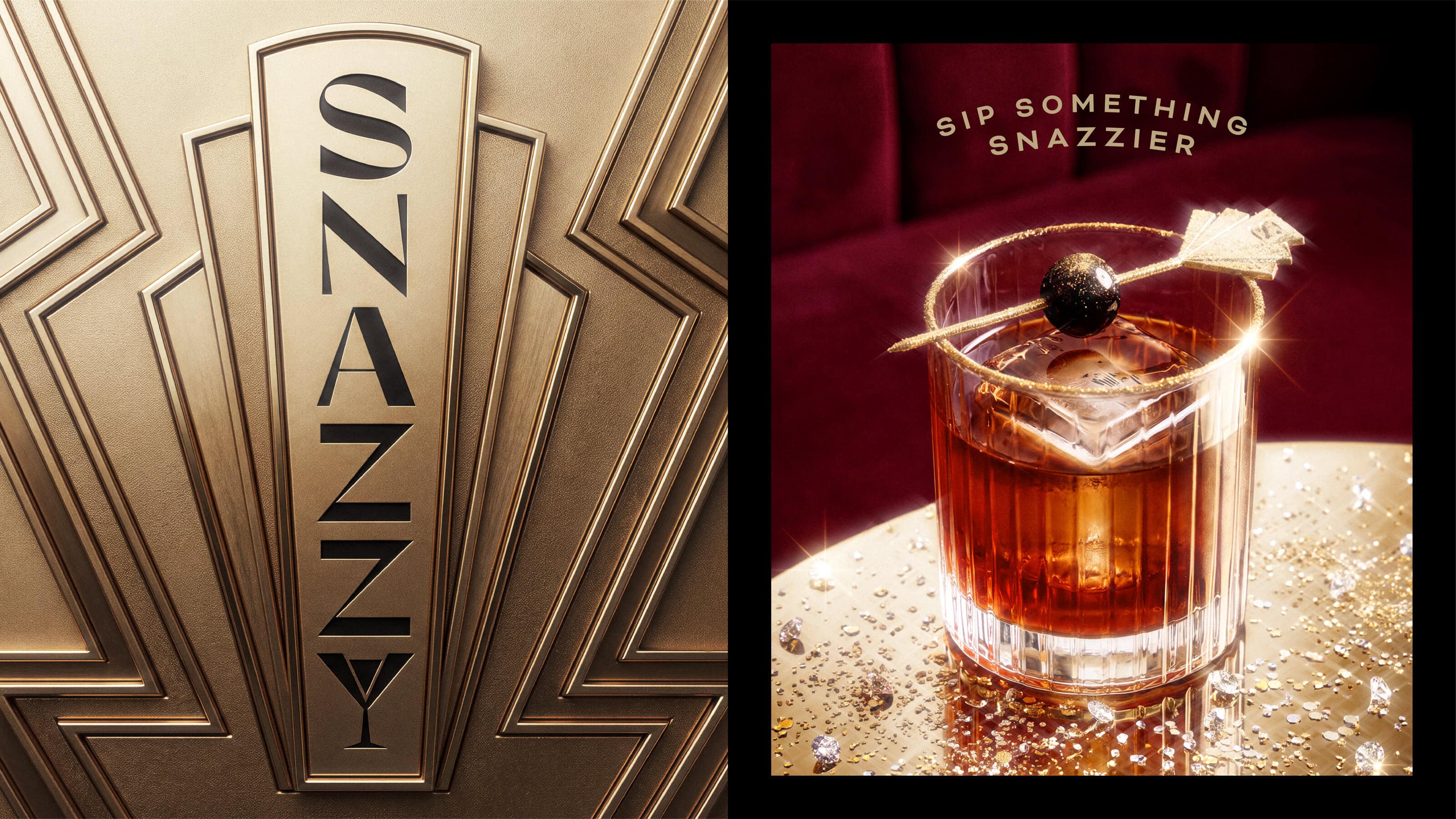
The result brings Snazzy’s product, personality and ambitions into the same world, giving an already award-winning cocktail a brand with just as much character.
As David Peterson, Founder and CEO of Snazzy, says: “Over the last year, the response to the liquid has given us real confidence in what we’ve created. People love the product and the choice of whiskey, vodka, tequila or rum, but we knew the identity needed to do a better job of communicating the quality and personality of Snazzy. Working with Thirst gave us the chance to build a brand that feels much closer to our ambition for the business and where we want to take it next.”
Sip something snazzier.
Latest
Latest trends, trips and tips from Team Thirst.
View all
Why RTDs Fit the New Shape of Socialising.
RTDs have become one of the fastest-moving parts of drinks. New flavours, formats, functions and alcohol levels keep arriving, giving people more choice than ever.
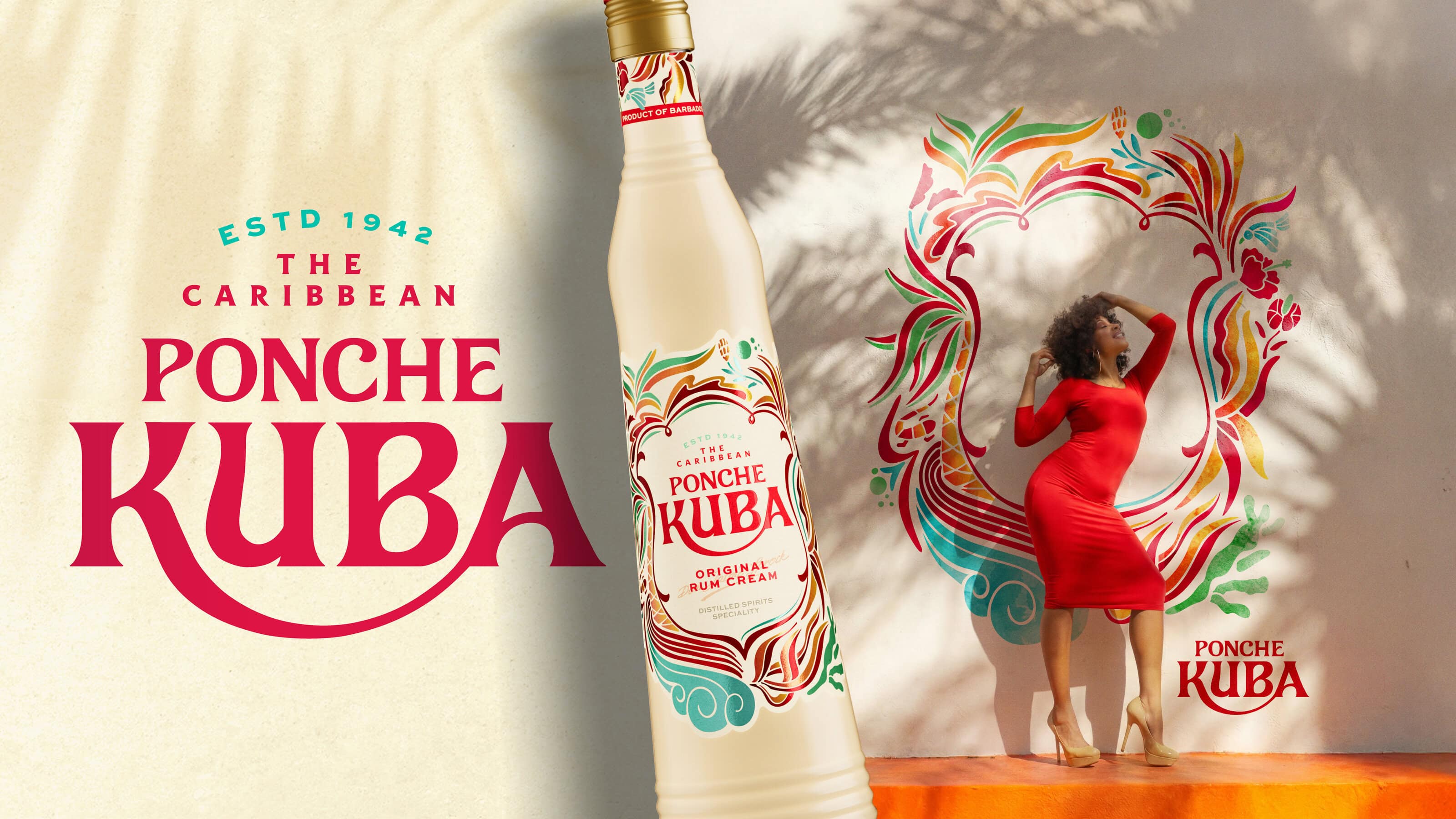
A Caribbean icon, refreshed: evolving Ponche Kuba for a new era
We refreshed 80-year-old Caribbean favourite Ponche Kuba with a vibrant new identity and lighter bottle—preserving its distinctive soul while reducing CO₂ emissions per case by 24.4%.
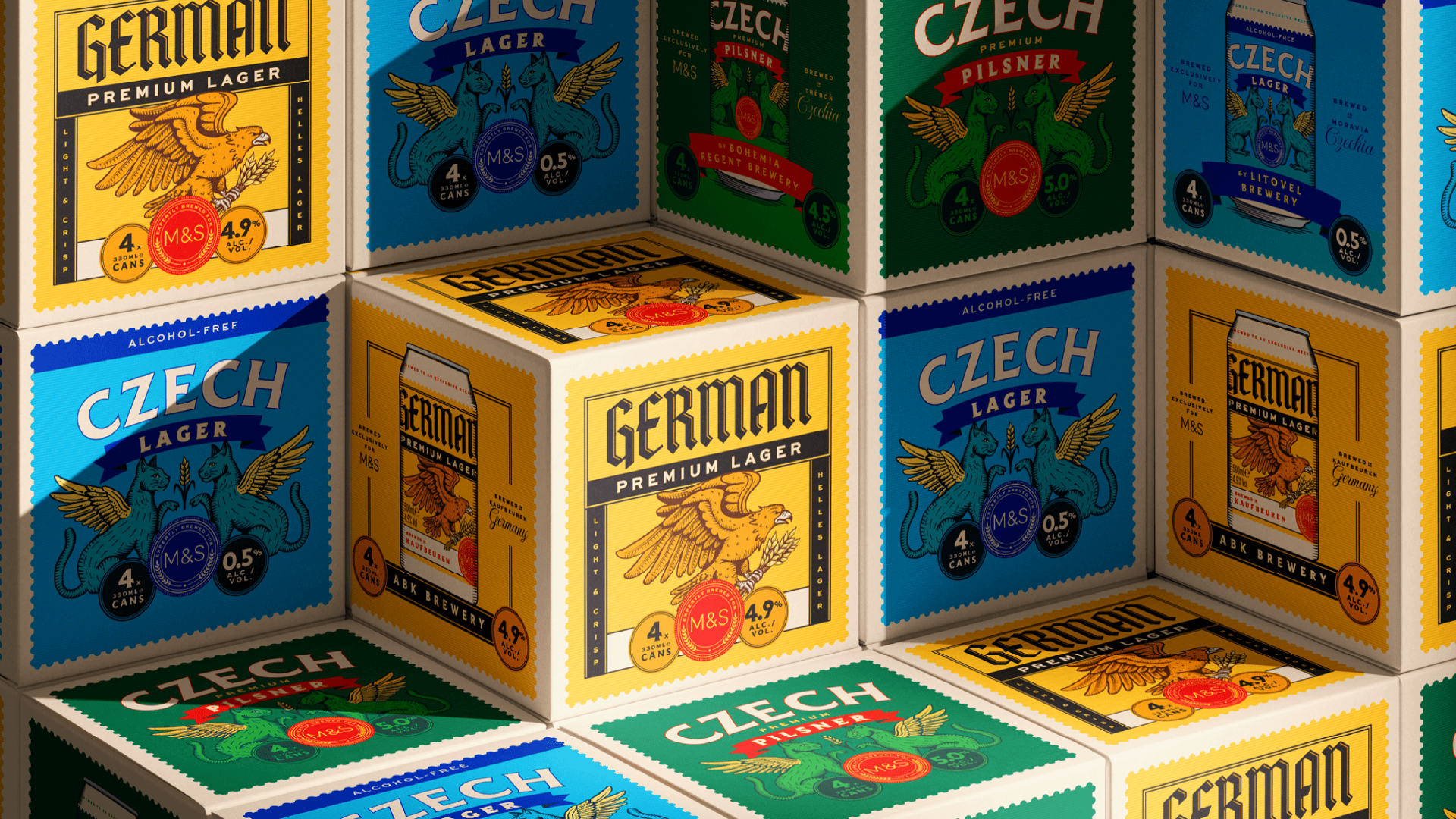
Reimagining the M&S Beer Portfolio
We partnered with M&S to redesign its Craft Beer and Continental Lager ranges, creating two distinctive packaging systems that combine storytelling, illustration and bold design to bring greater authenticity, shelf impact and character to the beer aisle.
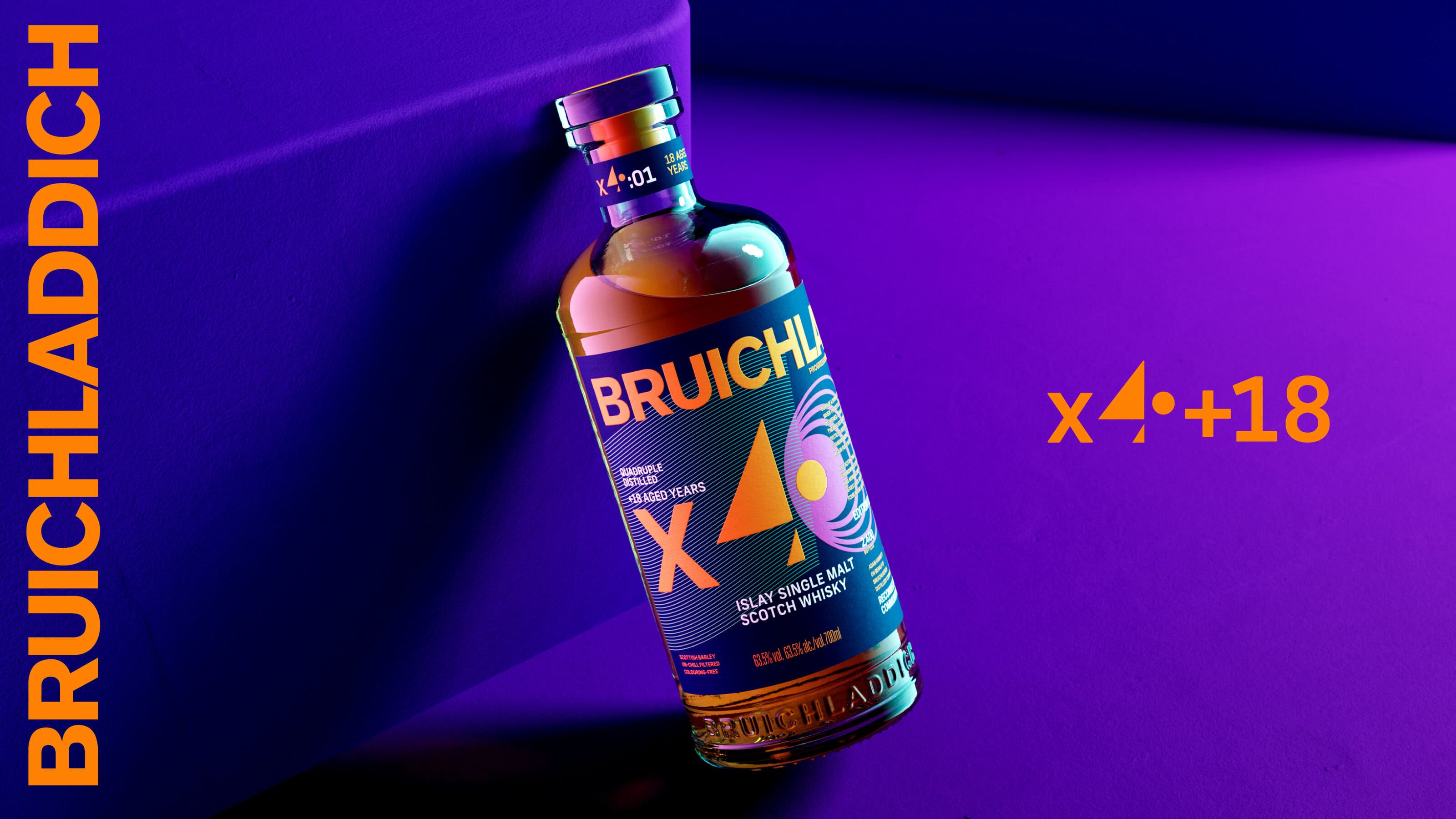
The Alchemy of Distillation: Designing Bruichladdich X4+18
For X4+18, the world’s first quadruple distilled 18-year-old single malt Scotch whisky, we transformed an invisible process into a bold visual language.
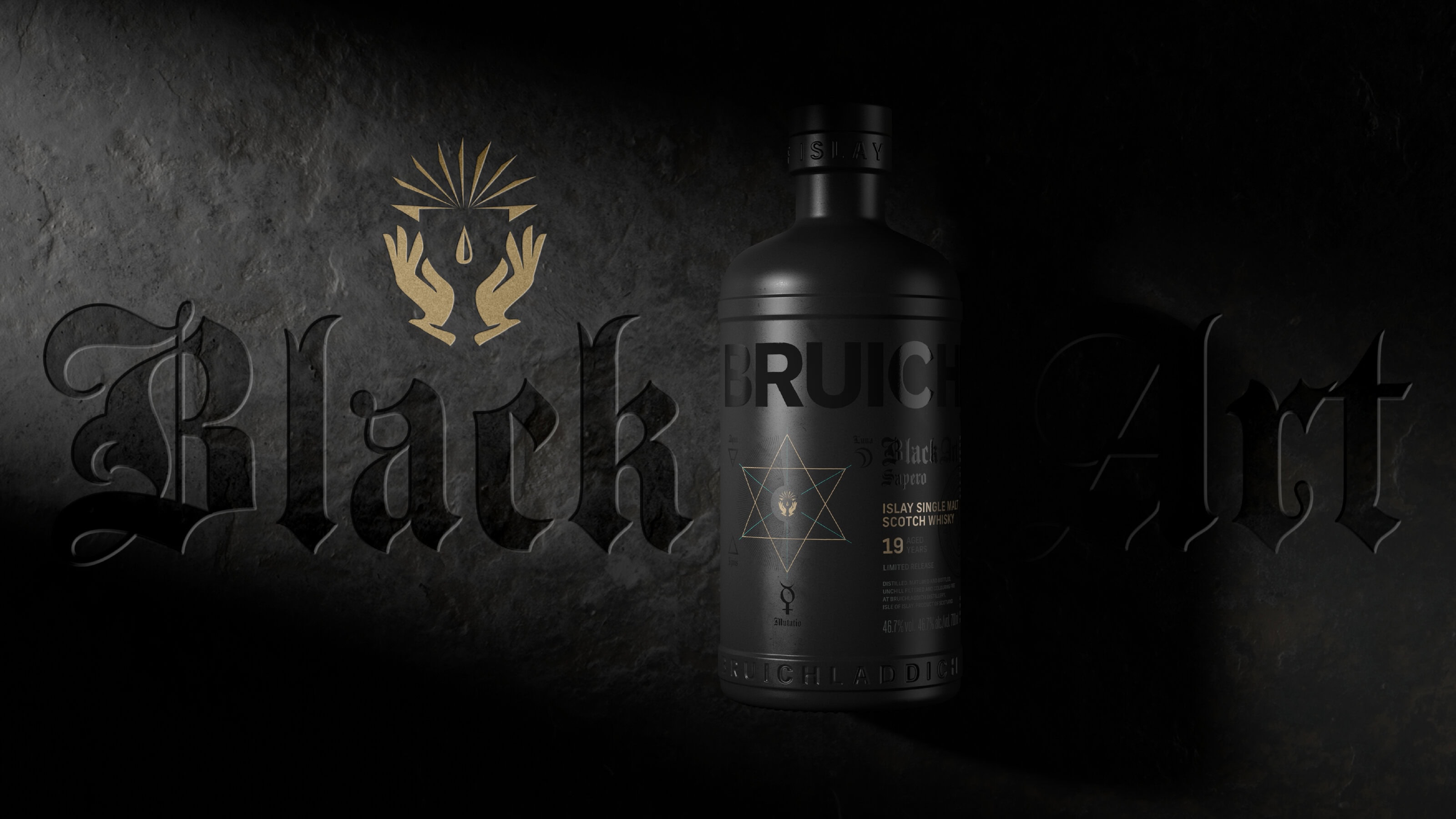
Evolving an icon through mystery and design with the latest Black Art for Bruichladdich.
We partnered with Bruichladdich to evolve Black Art for Global Travel Retail, creating a refined design world that brings the whisky’s mystery to life across packaging, brand world and activation.
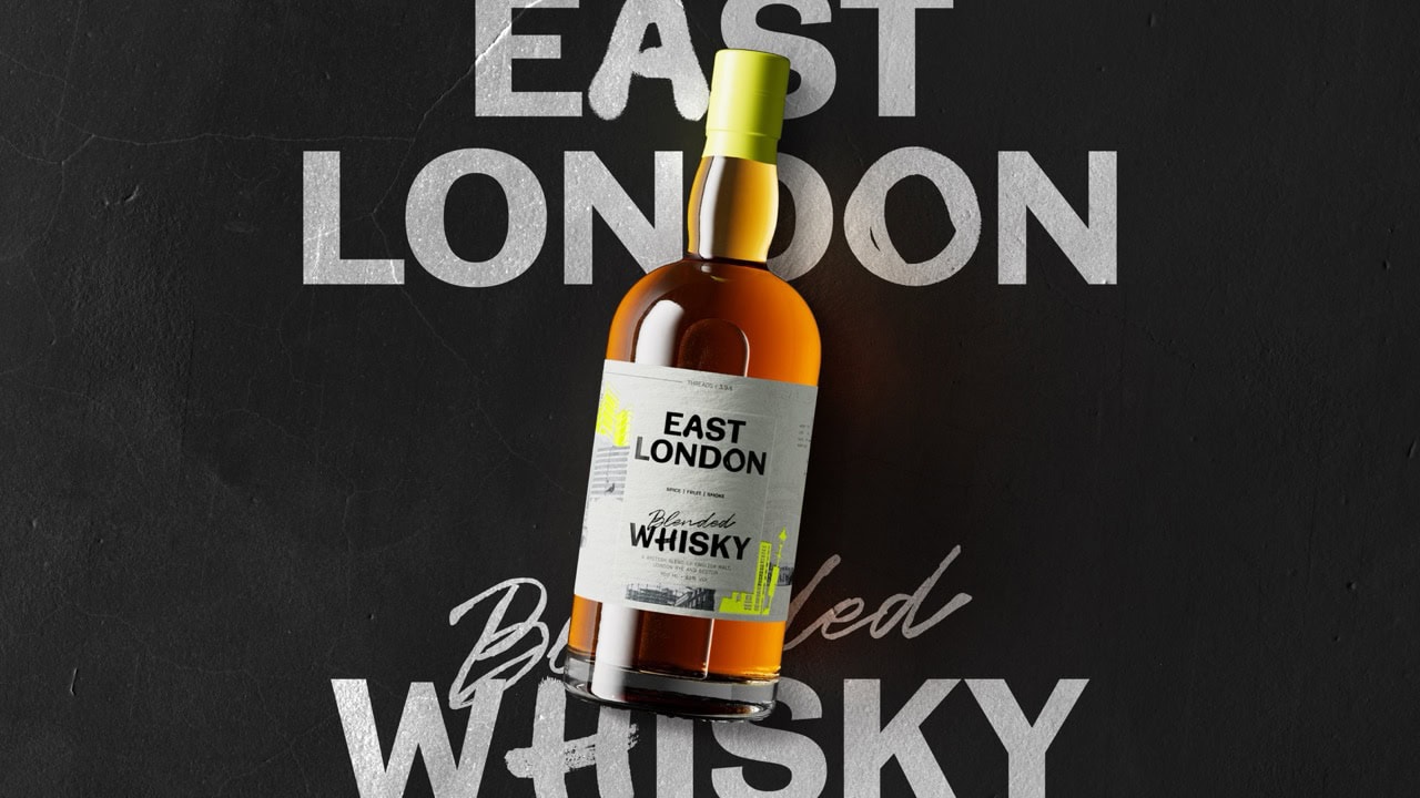
Redefining the Rules of Whisky with East London Liquor Company
East London Liquor Company’s first blended whisky brings the grit, culture and layered character of the neighbourhood into a bold, tactile packaging design by Thirst.
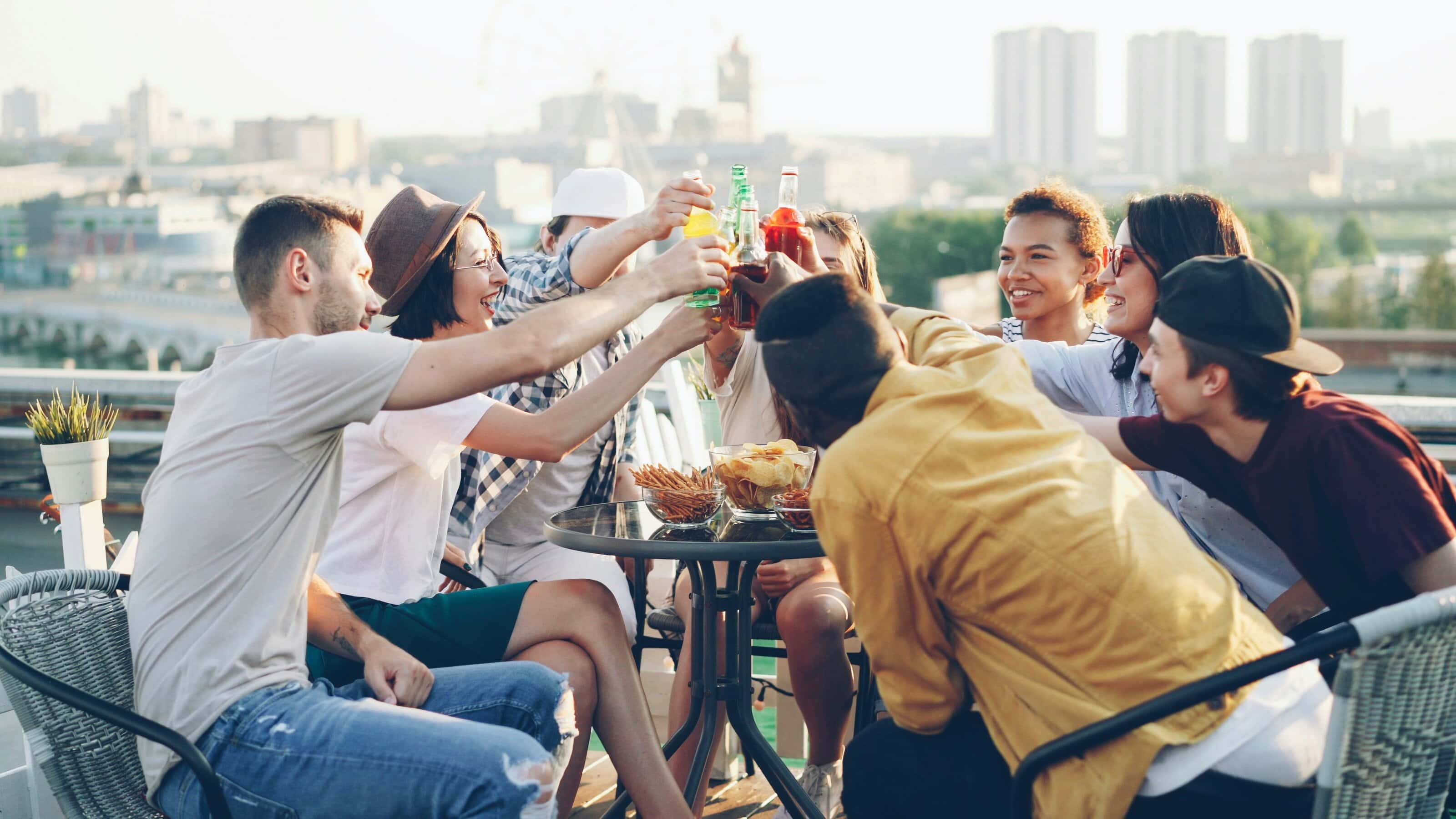
The Future of Socialising is here!
Socialising hasn’t disappeared, it’s recalibrated. As new rituals emerge across alcohol, softs and functional drinks, brands must rethink how they show up in the moments that matter.
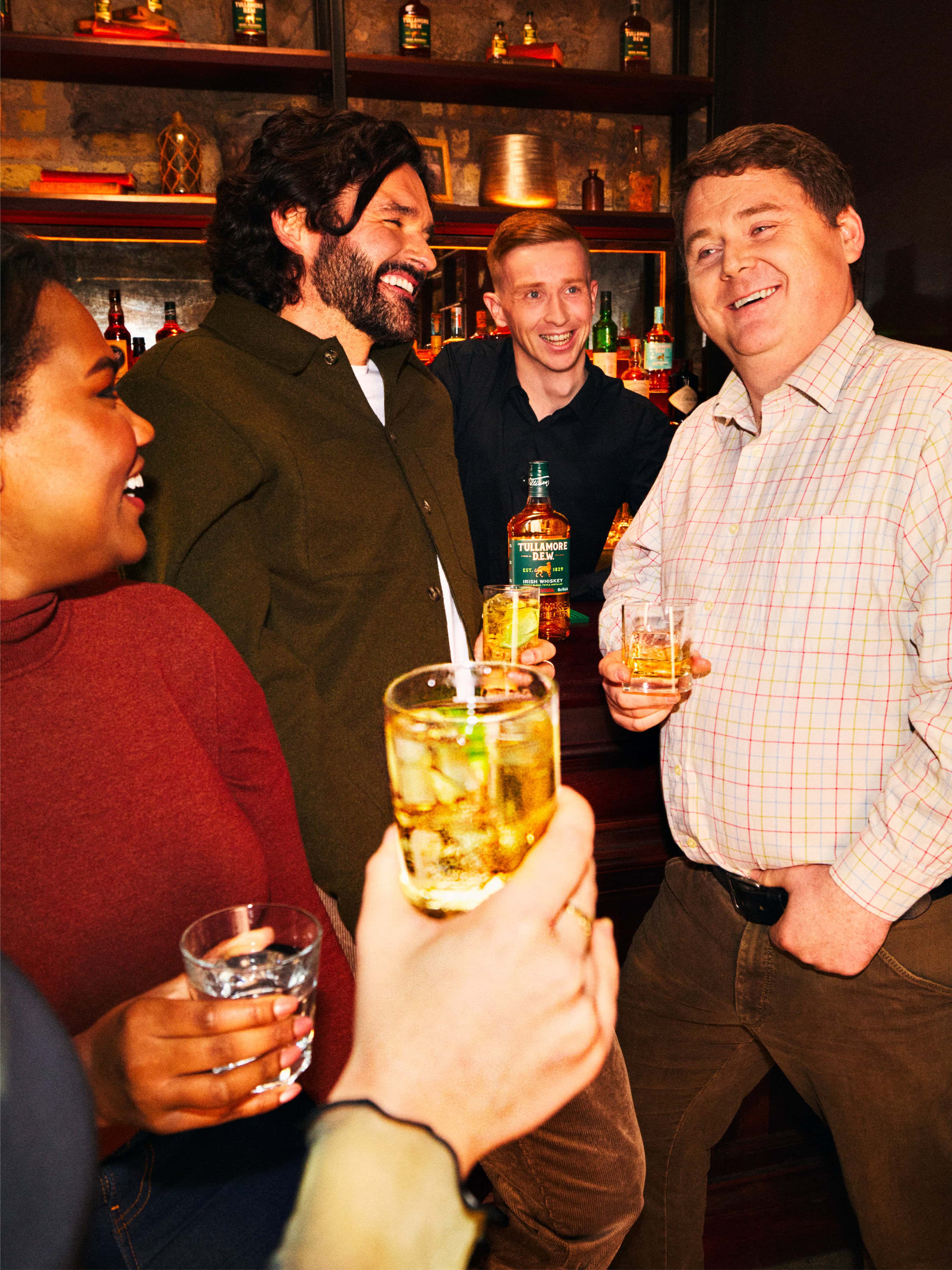
Creating moments that matter for Tullamore D.E.W.
Our latest work with Tullamore D.E.W. shows how craft-led photography and thoughtful BTL strategy can bring a global brand closer to the spirit of the town it’s named after.