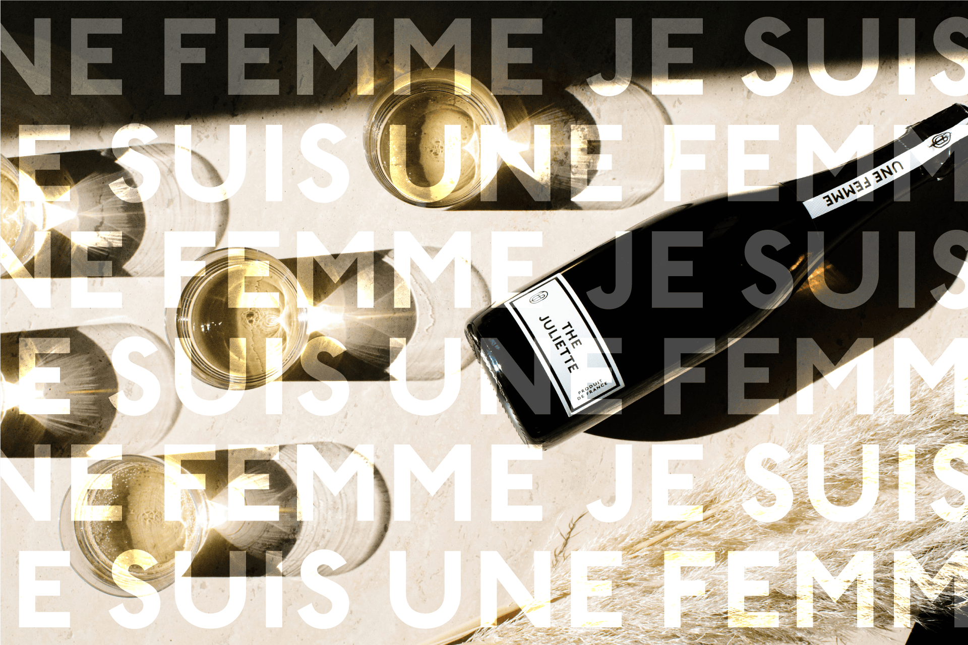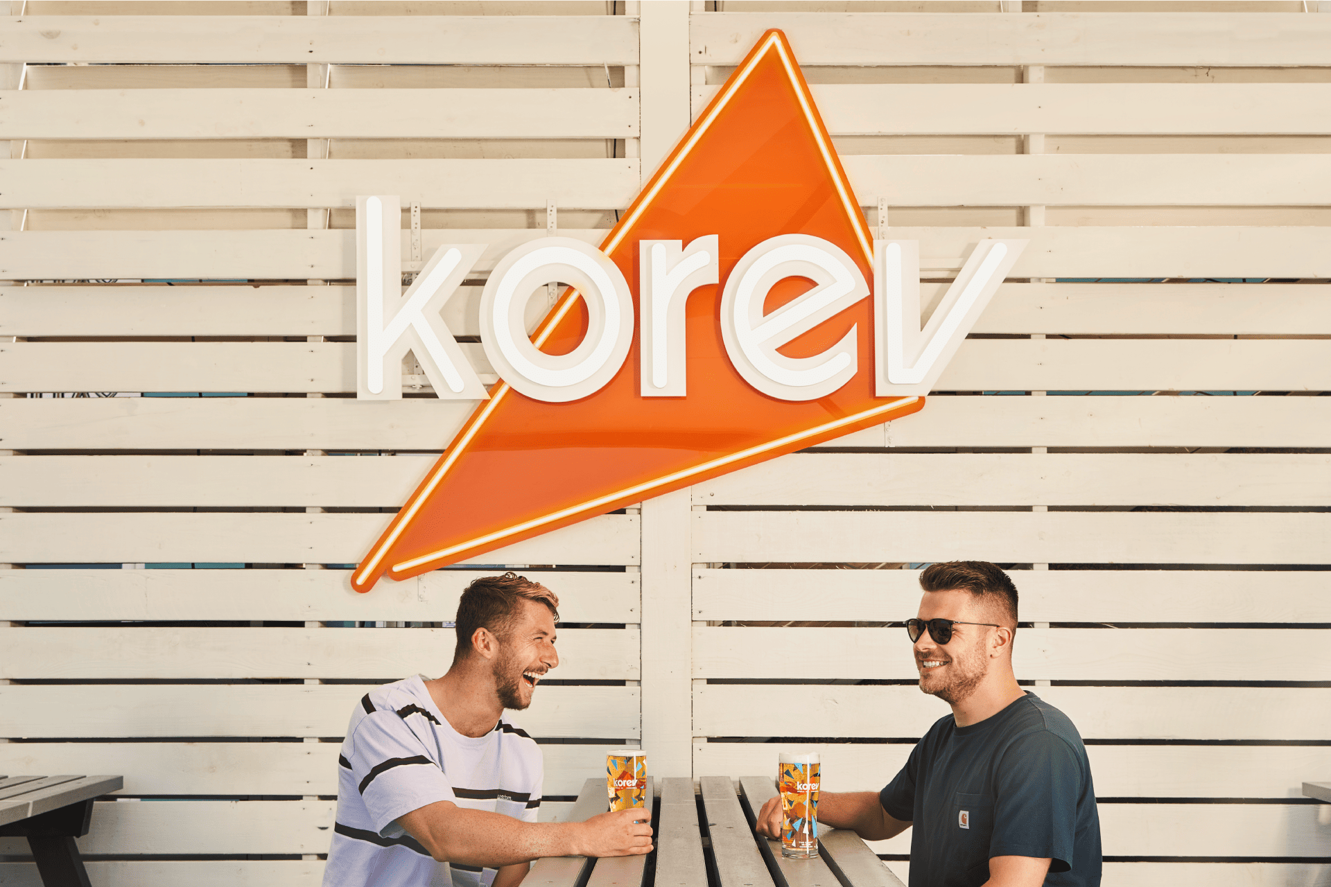
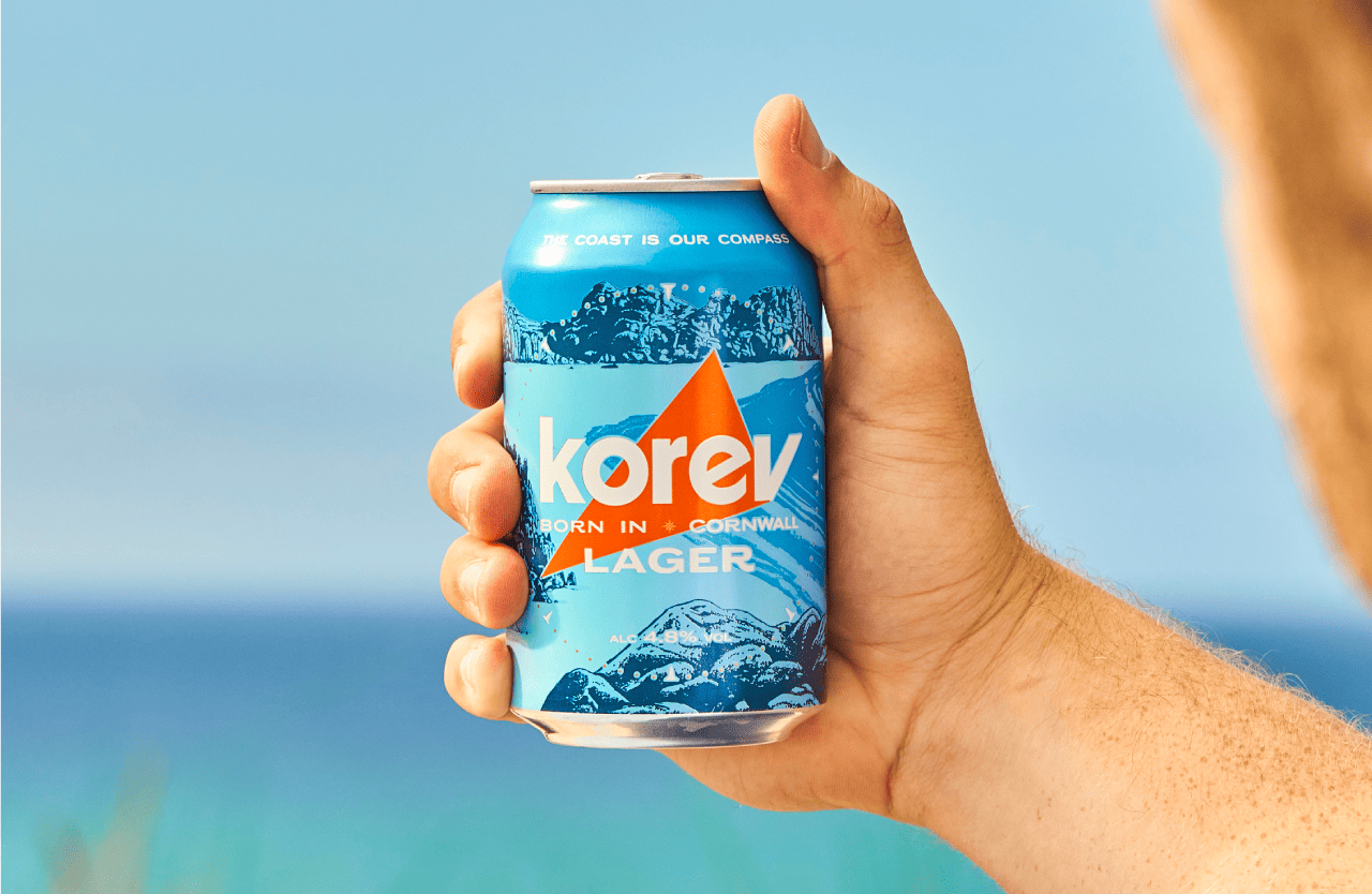
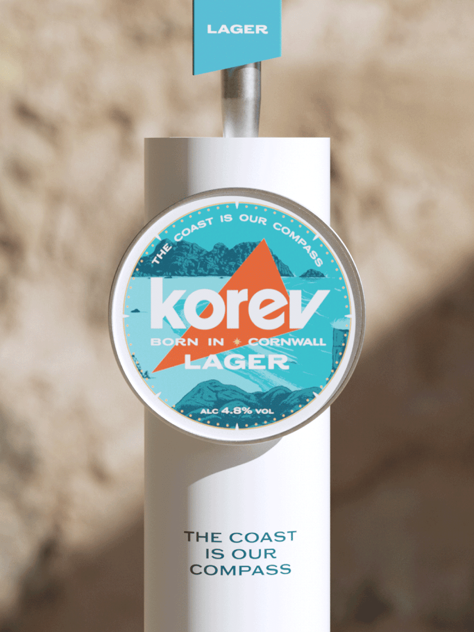
Korev Lager
Services
- Strategy
- VBI
- Packaging
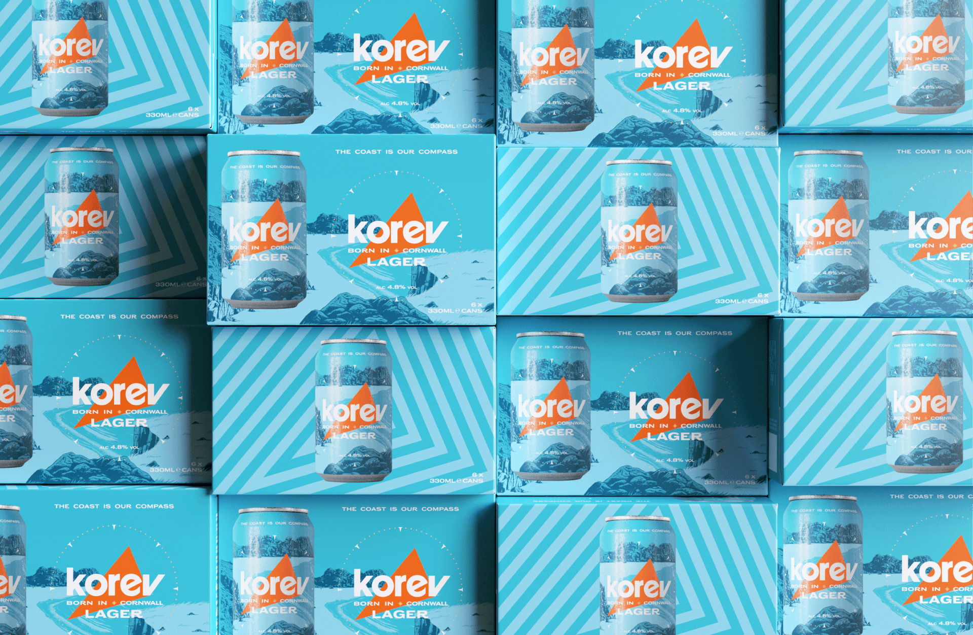
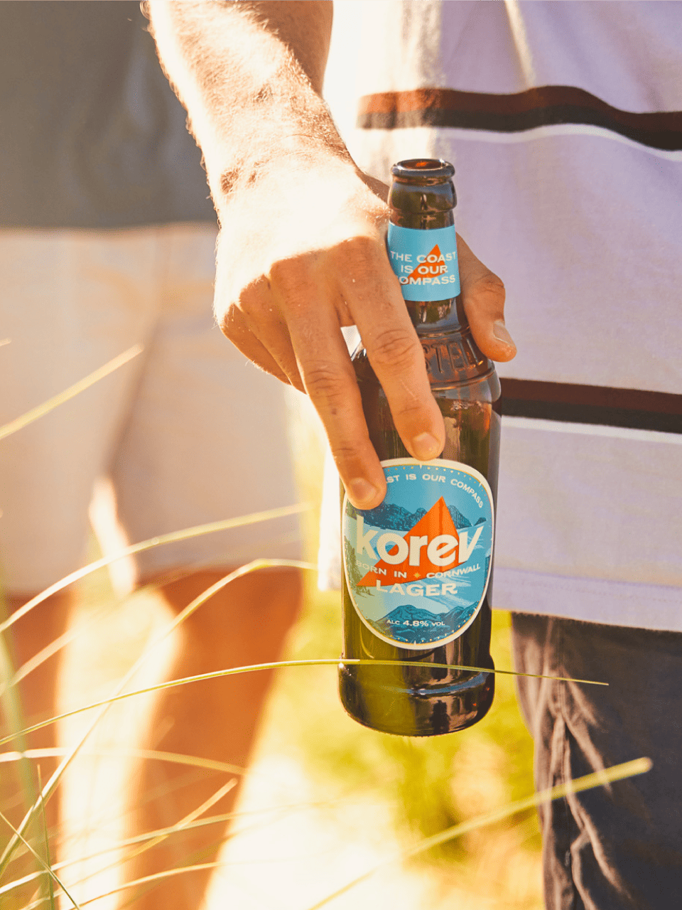
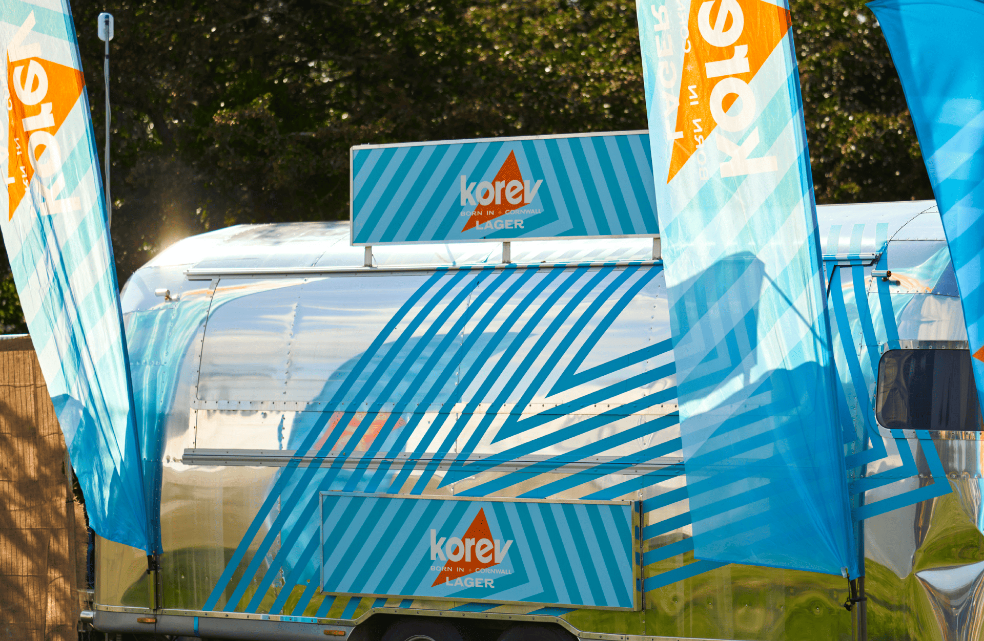
The Call of The Coast
Repositioning the brand to shift perception, premiumise and unlock national distribution. In a category built on lifestyle and attitude, we harnessed positive Cornish associations and turned Korev into a free spirited state of mind. Using the coast as our compass, we shaped a bold, dynamic and layered visual identity across the brand world, from pack to on-trade, to brand experience. Exporting the Cornish state of mind nationally.
Born in Cornwall and inspired by its surfers-paradise shoreline, premium lager Korev (meaning beer in Cornish) has the potential to be a key brand in St Austell Brewery’s portfolio. However thanks to a provenance and existing visual identity which were frequently misunderstood, the brand felt constrained rather than liberated by its county borders. To restore its relevance and win both on and off trade, it needed a complete overhaul.
With an abstracted Cornish county making the perfect South-Westerly pointer, a palette which speaks to fluorescent orange buoys floating in the sea and textures and vistas straight from the brand’s home, Korev feels like a refreshing rallying cry of the coast.


Related Projects
Explore more projects
View allBruichladdich Distillery Co.
Building a beacon of real progress
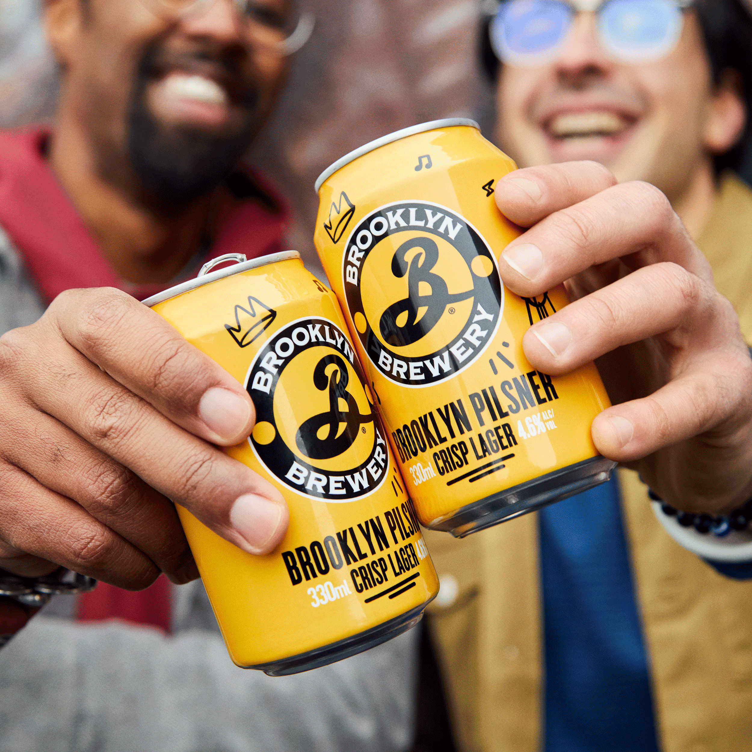
Brooklyn Brewery Pilsner
The New Beacon of Joy
Tennent’s Lager
Refreshing a true Scottish icon
Bruichladdich Distillery Co.
Redefining Luxury. Redefining Age.
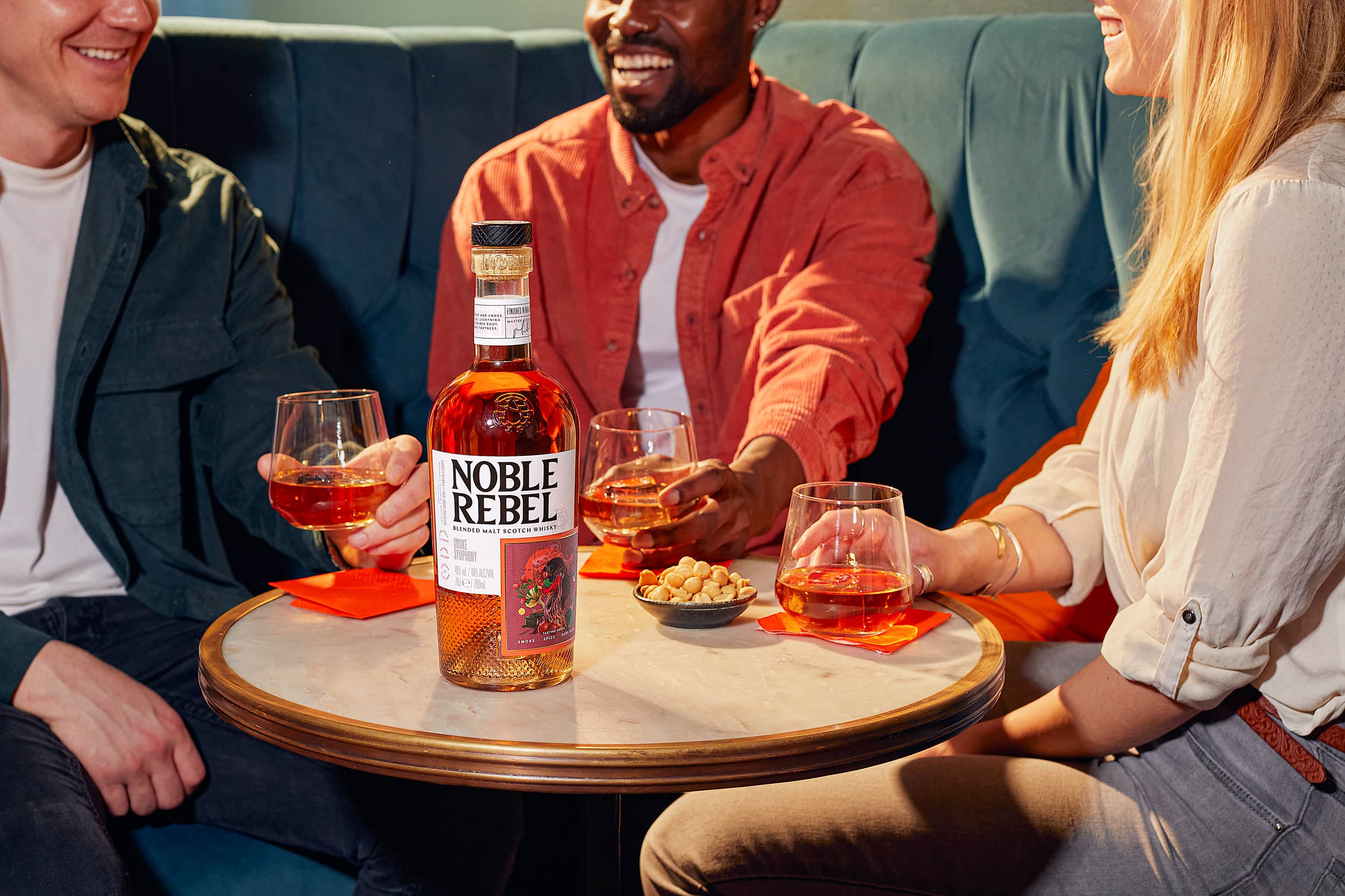
Noble Rebel
Pursuit of Whisky Possibility
Brooklyn Summer Ale
Switch Summer On
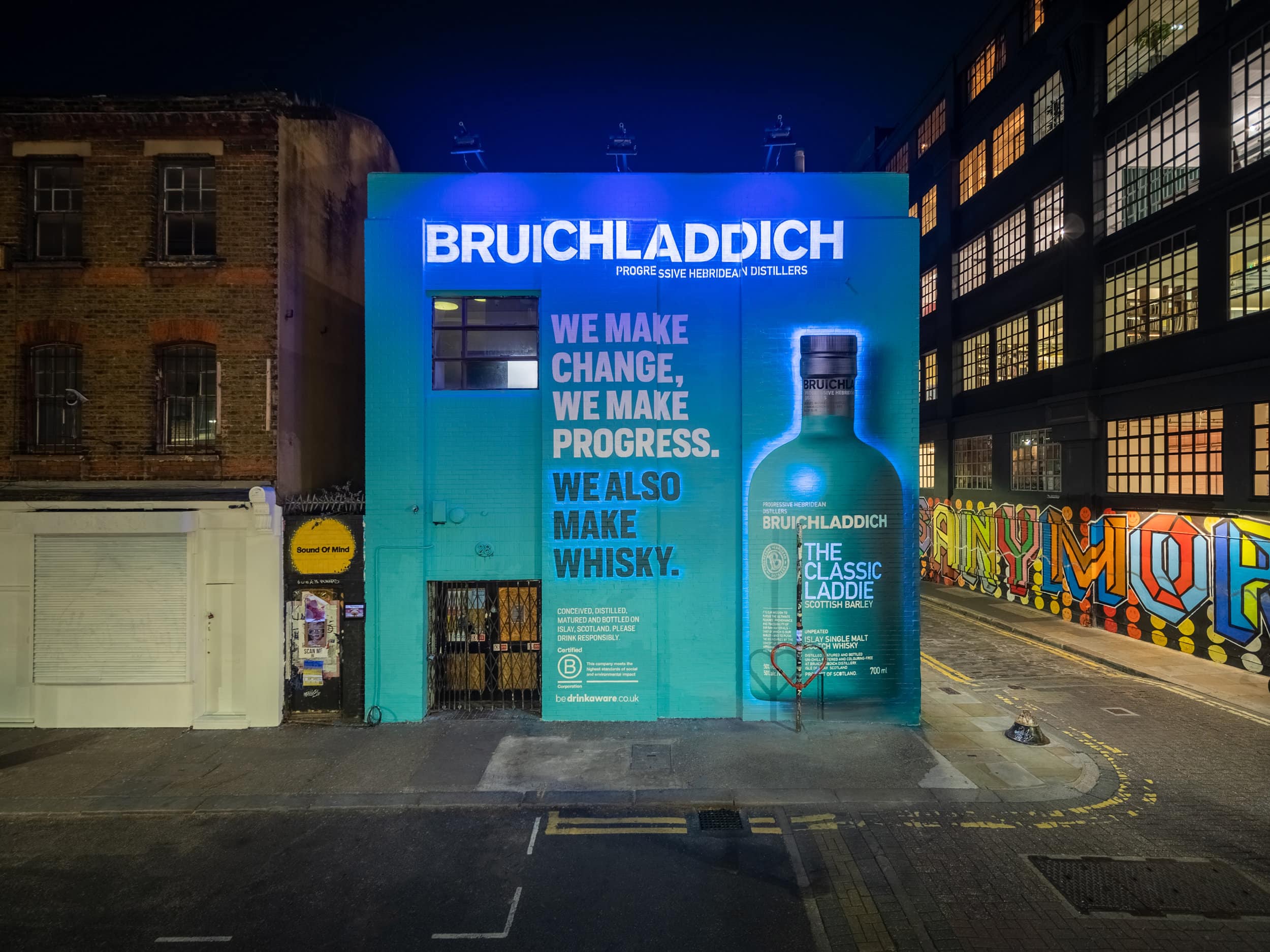
Bruichladdich Distillery Co.
We Also Make Whisky
The Famous Grouse
A BTL world Full of Character
The Botanist Campaign
An invitation to look further